The way your website adapts to different screens directly impacts your revenue. Understanding responsive design vs adaptive design helps you avoid spending 30-40% more on development while watching mobile visitors bounce. This guide helps you choose between these approaches based on your business goals, not developer preference.
How Did We End Up Here?
Fifteen years ago, websites were built for one screen size: desktop monitors running at 1024x768 pixels. When the iPhone launched in 2007, most companies built a separate "m.example.com" mobile site. You maintained two codebases. You updated the content twice. Search engines treated them as separate entities.
The industry tried several failed approaches. "Mobile-only" sites that redirected desktop users to a stripped-down experience. Dynamic serving that sent different HTML to different devices but broke constantly. Browser detection scripts that couldn't keep up with new devices launching every month.
Then Ethan Marcotte published "Responsive Web Design" in 2010. One codebase that flexed to fit any screen. Google blessed it with better rankings. The separate mobile site approach died within three years.
What's the Difference Between Adaptive and Responsive Web Design?
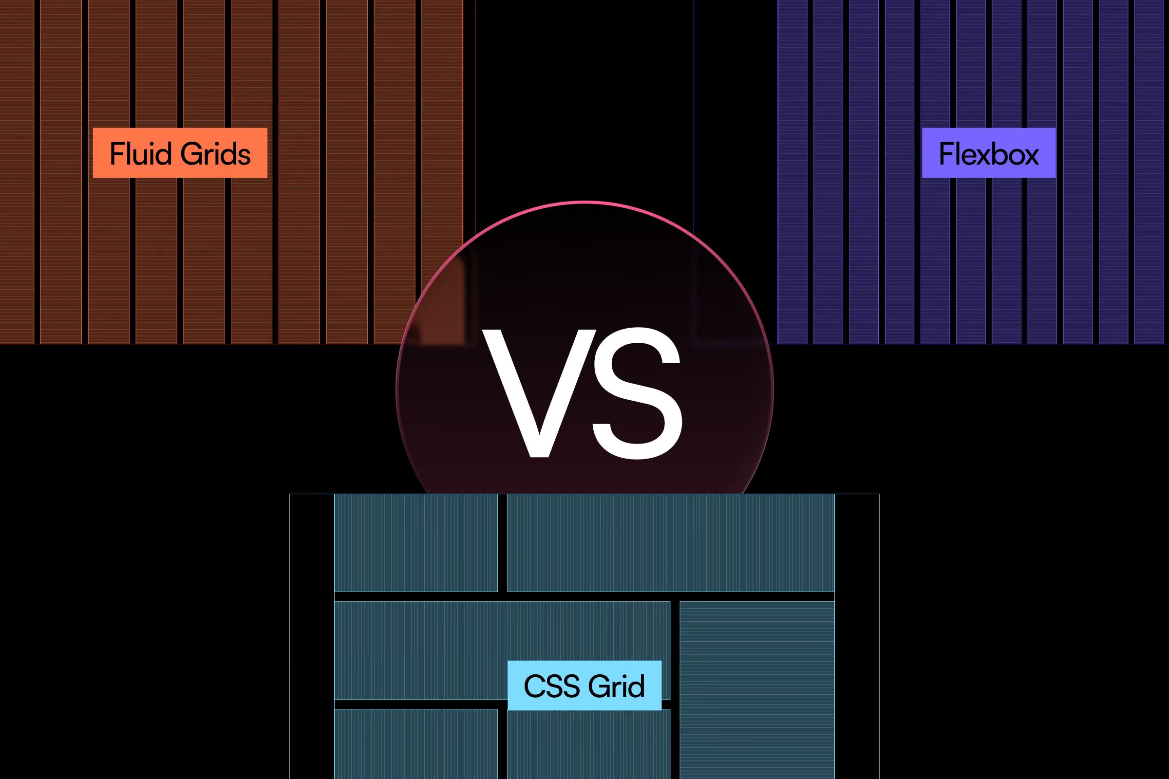
Responsive design uses fluid grids that stretch and compress. Your layout flows like water into whatever container holds it. One breakpoint triggers at 768px, another at 1024px. The browser does the math in real-time.
Adaptive design creates fixed layouts for specific screen widths. You build six distinct versions: 320px, 480px, 760px, 960px, 1200px, 1600px. The server detects the device and sends the appropriate template. Think of it as six separate websites living under one domain.
Here's what that means for your wallet: Responsive projects typically run $15,000-$40,000 for a standard business site. Adaptive starts at $25,000 and climbs to $60,000+ because you're building multiple versions.
Which Approach Fits Your Business?
Choose responsive if:
- Your content is primarily text, images, and standard forms
- You need consistent branding across all devices
- Your team updates content frequently
- Budget constraints require lower maintenance costs
- You're targeting broad consumer audiences
Choose adaptive if:
- You're redesigning a complex web application with distinct mobile workflows
- Different user segments need fundamentally different experiences (e.g., field technicians vs. office managers)
- You have resources to maintain multiple templates
- Page load speed is absolutely critical (finance, healthcare portals)
- You're serving markets with poor connectivity
{{vad-quote-1}}
How Do You Differentiate Between Responsive Design and Adaptive Design in Development?
Responsive projects move faster. Your team builds one template system with flexible components. A standard e-commerce site takes 8-12 weeks from wireframes to launch.
Adaptive web design vs responsive web design shows clear timeline differences. Each breakpoint needs separate design mockups, separate QA testing, separate browser compatibility checks. The same e-commerce site stretches to 14-20 weeks. You're not just building one site. You're building six coordinated ones.
Every content update requires more thought. Add a new product category to your navigation? With responsiveness, you update one component. With adaptive, you verify it works across all six layouts. Doesn't break the mobile menu. Doesn't overflow the tablet navigation. Fits the desktop mega-menu.
Mobile Adaptive vs Responsive: Performance Trade-offs
Responsive sites load all assets, then hide what doesn't fit. A desktop user downloads all the code. A mobile user downloads it too, even if their screen only shows 40% of it. This bloats the initial page weight.
Modern responsive frameworks solve this with conditional loading. Images load at appropriate resolutions. JavaScript bundles split by route. But your developers need to implement these optimizations. Many don't.
Mobile adaptive vs responsive performance differs significantly. Adaptive design serves device-specific code. Mobile users get lightweight templates optimized for 3G networks. Desktop users get the full experience with parallax effects and video backgrounds. When done right, mobile pages load 35-50% faster than their responsive equivalents.
The catch? You need server-side device detection that stays current. New iPhone? Your detection library needs updating. Folding phones? Another edge case. This requires active maintenance.
Search Engine Implications
Google officially recommends responsive design in their Mobile-Friendly Guide. One URL means simpler crawling. No canonicalization issues. Mobile-first indexing works seamlessly because your content is identical across devices.
Adaptive creates technical debt. Google must crawl multiple versions of each page. Your development team must implement dynamic serving signals correctly. One misconfigured header and Google serves the wrong version to the wrong users. Your rankings suffer.
That said, well-implemented adaptive doesn't hurt SEO. But it requires expertise most teams lack.
The Maintenance Burden
Your site isn't finished when it launches. It's just starting.
Responsive maintenance:
- One codebase to update
- One content management workflow
- Browser testing at three main breakpoints
- Security patches apply once
Adaptive maintenance:
- Six templates to keep synchronized
- Complex content workflows
- Testing across all breakpoint combinations
- Six times the surface area for bugs
A small business updating their services page: 20 minutes with responsive. 45 minutes with adaptive, verifying every layout variation.
For teams lacking dedicated developers, this difference compounds monthly. You spend the budget on maintenance instead of improvements.
The Strongest Argument Against Responsive
Responsive design forces compromises. You're designing for the lowest common denominator. Complex data tables that work beautifully on desktop become awkward on mobile. Multi-column dashboards collapse into single-column scrolling lists.
This criticism is valid for certain applications. Trading platforms where professionals need 6-8 data streams visible simultaneously. Medical record systems where doctors need side-by-side chart comparison. Enterprise dashboards built for 24-inch monitors.
These scenarios demand adaptive or responsive evaluation favoring adaptive approaches. The mobile experience isn't a compressed desktop. It's a fundamentally different tool built for different tasks. A field service app shows current job details and quick actions. The desktop version shows scheduling optimization and resource planning.
But here's the reality check: 85% of business websites don't face this constraint. Your company site, online store, booking system, or lead generation funnel works fine with responsive design. The content naturally adapts. The user goals stay consistent.
Only pursue adaptive if you can articulate exactly why your mobile and desktop users need different feature sets. "It might be nice" doesn't justify the cost.
Common Pitfalls That Drain Your Budget
Building responsive but ignoring touch targets
You've seen this. Buttons that work perfectly with a mouse cursor become impossible to tap with a thumb. Developers implement fluid grids but keep desktop button sizes at 28px instead of the recommended 44px minimum from Apple's Human Interface Guidelines.
This happens because responsive design focuses on layout, not interaction. Your CSS makes elements flexible. But nobody increases the tap target size for mobile users.
The damage? Users struggle with your mobile checkout. They tap the wrong button. They abandon carts. Your mobile conversion rate sits at 1.2% while desktop converts at 3.8%. You're losing $50,000+ annually on a $3,000 fix.
Choosing adaptive without dedicated developer resources
Adaptive sounds sophisticated. Your competitor mentions it. You ask your agency to build it.
Then reality hits. Your two-person team can't maintain six layout variations. An iOS update changes how Safari renders your tablet layout. It breaks for three weeks because nobody notices until a client complains.
You've spent $48,000 on development. Your ongoing maintenance runs $2,400/month instead of the $800/month responsive would've cost. That's $19,200 yearly on preventable overhead.
Mixing approaches inconsistently
Some pages are responsive. Others use adaptive. Your designer made different decisions for different sections. It seemed logical during development.
Users experience jarring transitions. The homepage flows smoothly at all sizes. The product catalog suddenly snaps between fixed layouts. The checkout returns to fluid design. Nothing feels cohesive.
The cost: increased development complexity, higher QA expenses, and confused users who don't trust the inconsistent experience. You've created the worst of both approaches.
Making Your Decision
Start with your user data. Open Google Analytics. Check your device breakdown for the past 90 days.
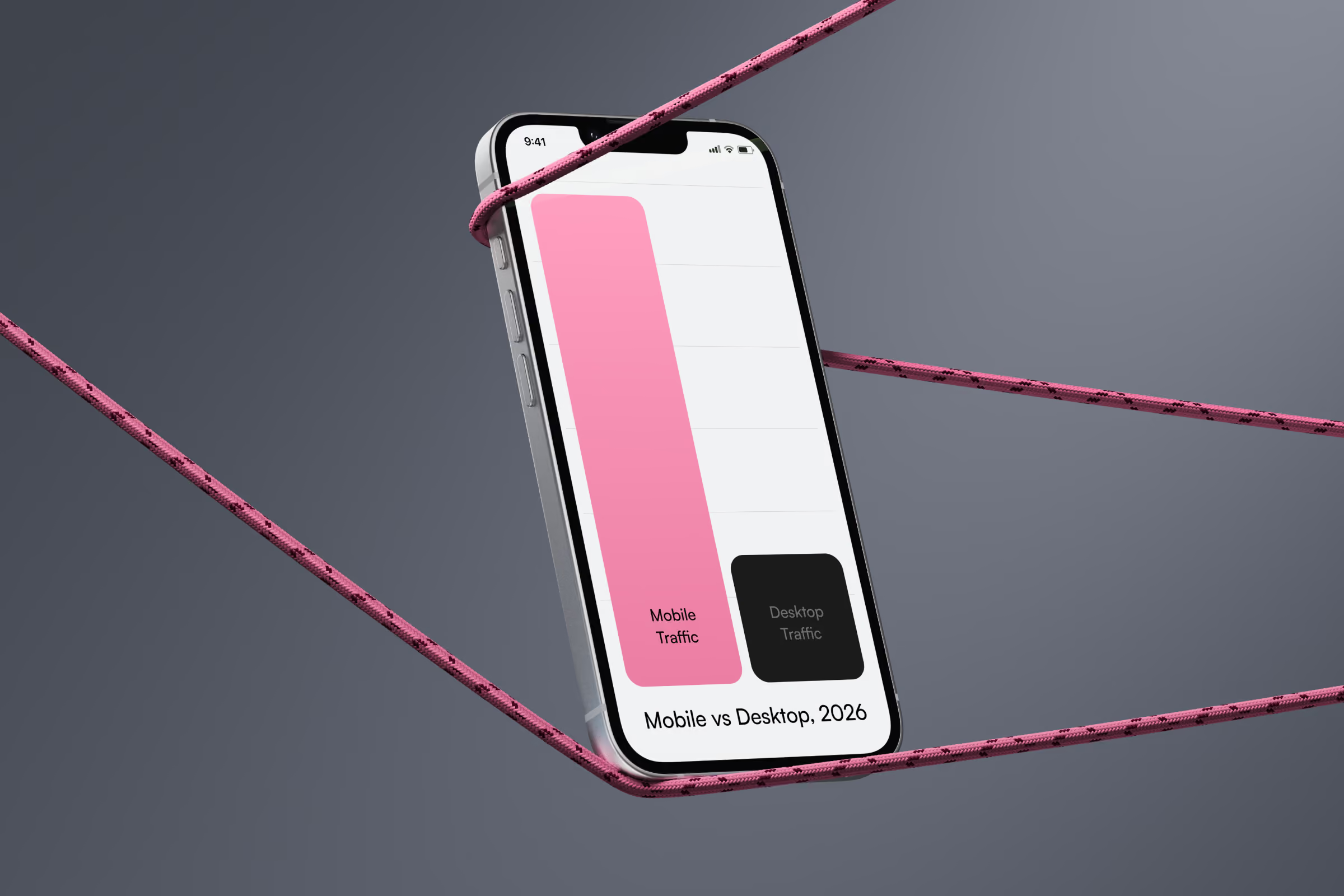
If mobile traffic exceeds 50%: You need excellent mobile performance. But that doesn't automatically mean adaptive. Modern responsiveness can deliver it with proper optimization.
If the desktop dominates at 70%+: Responsive makes sense. You're not building primarily for mobile. Don't overcomplicate.
Check your content update frequency. Daily changes? Weekly blog posts? Responsiveness saves time. Monthly updates or less? Adaptive's maintenance burden matters less.
Consider your team honestly. Do you have developers on staff? Can they handle server-side device detection? Will they maintain multiple templates? No on any question? Choose responsiveness.
Calculate your five-year cost. Adaptive might cost $15,000 more upfront. But if you save $1,200 annually in maintenance, you break even in year six. If your site redesigns every three years, you never recover that premium.
{{mike-quote-1}}
How Is Responsive Design Different from Adaptive Design Technically?
Adaptive and responsive design aren't pure categories. Most modern sites use hybrid approaches. They're fundamentally responsive but swap out entire components at key breakpoints.
Your mobile users see a hamburger menu. Desktop users get a full horizontal navigation. That's an adaptive pattern inside a responsive framework. The underlying grid flexes. Major UI paradigms swap.
This hybrid approach costs less than pure adaptive while solving the same problems. You maintain one codebase with conditional components. You get appropriate experiences per device. You avoid the six-template multiplication.
Implementing this hybrid model requires deep understanding of viewport meta tags, server-side rendering considerations, and how device detection impacts client-side rendering performance. Your internal team might lack experience with CSS3 Flexbox optimization for touch targets or RESS (Responsive Design with Server-Side Components) architecture. Finding a responsive design agency partner with proven mobile usability standards expertise ensures your breakpoints align with actual user behavior data, not arbitrary pixel widths. They'll audit your content delivery strategy and recommend whether dynamic content delivery or static responsive layouts better serve your specific user interface requirements.
When your developer says "responsive," ask what they mean. Do they mean fluid grids with no component swapping? Or intelligent responsive with strategic adaptive elements? The second option often delivers the best balance.
Adaptive vs Responsive Design: Your Next Steps
Don't ask "which is better?" Ask "which fits my specific situation?" You now understand the cost implications. The maintenance burden. The performance trade-offs.
For most businesses reading this: responsive design with strategic component swapping gives you 90% of adaptive's benefits at 60% of the cost. You're probably in that majority.
The 10% who genuinely need pure adaptive: you're running complex applications with distinct mobile workflows. Budget accordingly. Build a team that can maintain it. Accept the increased overhead as the price of the superior experience you require.
Either way, you're now equipped to discuss this intelligently with your development team. Making informed decisions about adaptive versus responsive approaches means you understand the business implications, not just the technical jargon.


.avif)