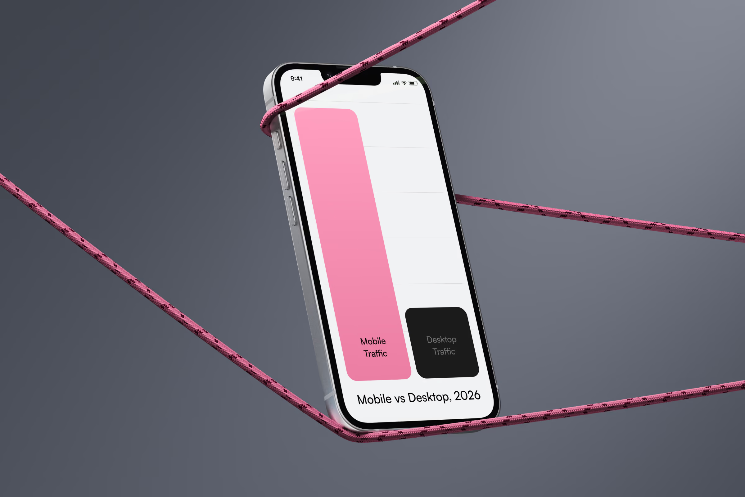
Mobile devices generate 63% of all web traffic in 2026, marking a decisive shift in mobile vs desktop traffic patterns. Users spend 4.2 hours daily on mobile browsers. For businesses, responsive web design drives conversion rates 11-18% higher than non-responsive alternatives—a critical metric in today's mobile internet usage stats.
How Did We Get Here? The Path from M-Dot to Mobile-First
A decade ago, desktop dominated with 78% of traffic. Companies built separate mobile sites—those m-domain URLs you rarely see anymore. These sites required duplicate content management, featured stripped-down experiences, and constantly fell out of sync with desktop versions.
Around 2015, Google introduced mobile-first indexing. The industry tried adaptive design as a compromise—detecting devices server-side and serving different templates. It failed spectacularly. Device detection was unreliable. Maintenance costs doubled. Content parity issues tanked SEO.
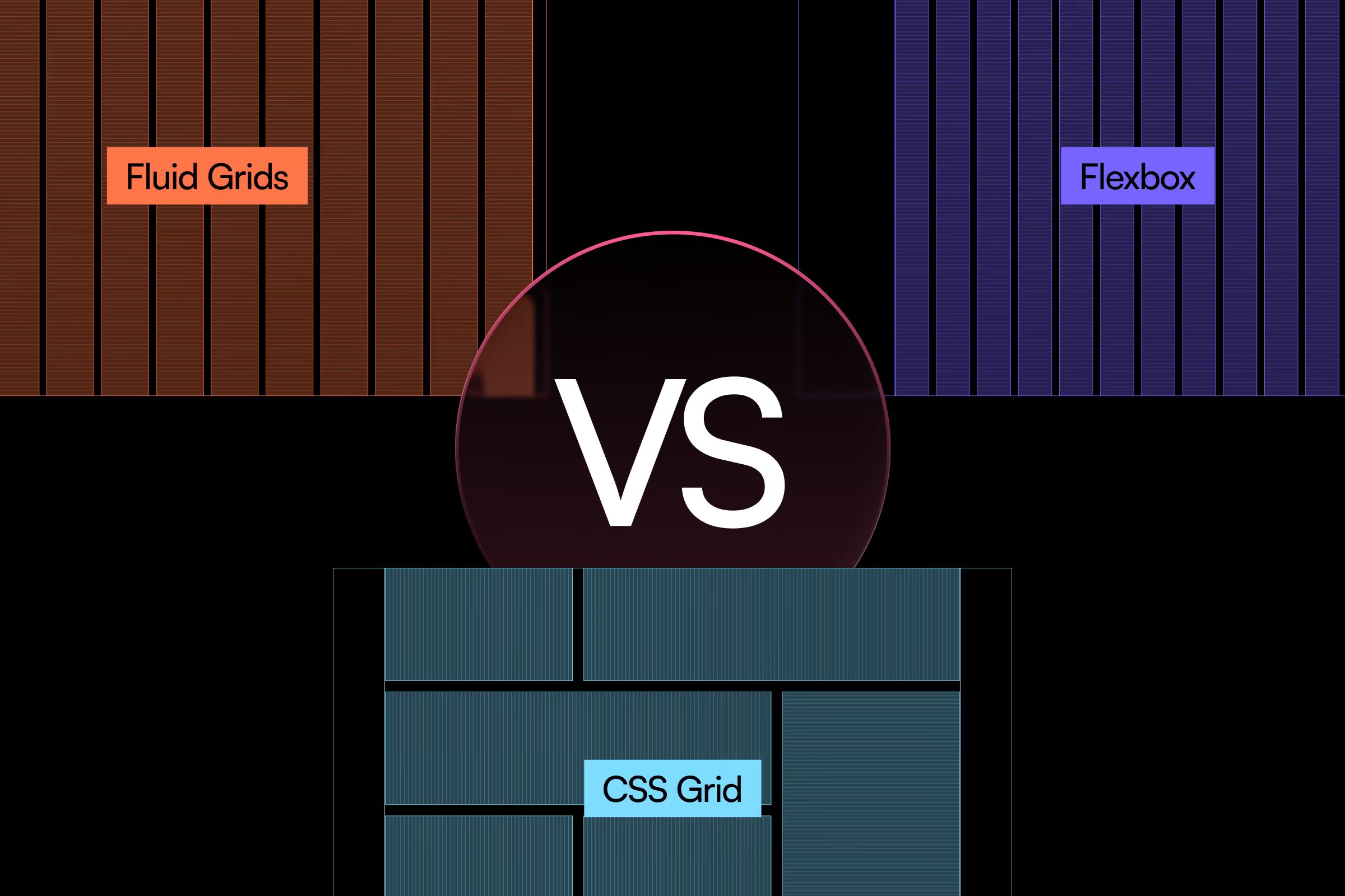
Responsive design eliminated what killed its predecessors: one codebase, fluid grids, CSS media queries adapting to any screen. Mobile traffic surged from 22% in 2014 to 63% today. Development costs dropped 40-60% compared to maintaining separate sites.
Mobile vs Desktop Usage: What the Numbers Tell Us
Mobile vs desktop usage patterns reveal 63% of global web traffic mobile vs desktop now originates from smartphones and tablets as of Q1 2026. Tablets add 4%. PC holds 33%—a complete reversal from a decade ago when PC vs mobile ratios heavily favored desktop computing.
Industry breakdown reveals critical differences in usage:
- E-commerce: 71% mobile traffic, 58% mobile transactions
- B2B services: 52% mobile traffic, 34% mobile conversions
- News/media: 79% mobile traffic
- Healthcare: 68% mobile traffic, 41% appointment bookings
Geography matters in mobile vs desktop statistics. Asia-Pacific hits 72% mobile. North America sits at 61%. Europe reaches 59%.
Time of day creates dramatic swings in user behavior. Mobile peaks 7-9 PM at 76% of traffic. Desktop dominates 9 AM-5 PM workdays at 54%, demonstrating clear PC vs smartphone preference patterns throughout the workday.
Conversion Rate Mobile vs Desktop: The Narrowing Gap
Conversion rate mobile vs desktop analysis shows mobile converts at 2.9% across industries versus 4.1% on desktop. This 1.2 percentage point gap has shrunk from 2.3 points in 2023. Well-optimized responsive sites achieve near-parity: 3.8% mobile versus 4.2% desktop—answering the question desktop vs mobile which converts better depends entirely on implementation quality.
The gap correlates directly to page speed and UX. Sites loading under 2 seconds show 0.3% gap. Sites taking 5+ seconds show 2.1% gap.
These conversion rate gaps tell you what's happening, but executives and stakeholders typically ask a harder question: "What's the actual dollar impact of closing that gap?" A 1.2 percentage point conversion difference sounds modest until you multiply it across annual traffic volume and average order value. That's where conversion statistics transform into website ROI calculations.
The business case for mobile optimization extends beyond traffic shares into Core Web Vitals improvements, bounce rate reduction, and cross-device user journey optimization—all of which compound into measurable revenue lift. For companies evaluating whether to invest $25,000-$300,000 in responsive redesign, calculating the ROI of mobile-first design provides the financial modeling framework to forecast returns, justify budgets, and set realistic performance benchmarks that align with business objectives.
Each extra second of loading speed costs 7% of conversions. Mobile users abandon 53% faster than desktop users when facing poor user experience.
Three Mistakes Destroying Your Mobile Revenue
Setting body text below 16px seems like a design choice. Smaller fonts look refined in desktop mockups. They create visual hierarchy. Designers learn this in school.
Google penalizes sites requiring pinch-to-zoom. Users lose scroll position when zooming. Form inputs behave erratically at zoom above 100%. A financial services site increased body text from 14px to 16px. Time-on-page jumped 23%. Bounce rate dropped from 58% to 43%. That's hundreds of thousands in recovered revenue from one CSS change.
Hiding navigation behind hamburger menus saves screen space. Three horizontal lines communicate "menu" universally. The pattern is established. It looks clean.
Users access hamburger menus 57% less than visible navigation across 82 e-commerce sites studied. Hiding product categories reduces category page visits 31-42%. A home goods retailer exposed their top 4 categories as visible tabs above a hamburger with full taxonomy. Category engagement increased 47%. Path-to-purchase shortened by 1.3 steps—a measurable improvement in analytics mobile vs desktop performance.
Auto-playing video increases engagement by 80% according to marketing metrics. Video demonstrates products better than images. Auto-play ensures users see your message.
Auto-play consumes cellular internet data without consent. 63% of users report negative brand perception toward sites auto-playing video on mobile. Even on WiFi, unexpected audio causes 71% to immediately exit or frantically search for mute. An automotive site disabled mobile auto-play while adding obvious play buttons. Video completion rates jumped from 12% to 34%. Pages-per-session grew 18%.
Beyond conversion loss from poor UX, there's a fourth risk category that catches businesses off-guard: legal exposure from inaccessible responsive design. While 81% of users abandon non-optimized mobile forms, consider that 26% of U.S. adults live with some form of disability—and many rely on assistive technologies that fail when sites ignore accessibility standards. Non-compliant responsive sites face not just bounce rate issues but Americans with Disabilities Act lawsuits, which increased 14% in 2025 and target both desktop and mobile implementations equally.
Responsive breakpoints, touch interactions, and dynamic content that work perfectly for able-bodied users can completely block access for screen reader users if WCAG guidelines aren't followed. Navigating ADA compliance in responsive web design breaks down Section 508 requirements, explains how responsive accessibility differs from desktop-only compliance, and provides accessibility audit checklists that prevent legal vulnerabilities while maintaining the conversion-optimized experiences your mobile users expect.
What Drives Mobile Abandonment?
Three friction points cause 68% of mobile exits, directly impacting bounce rate mobile vs desktop comparisons.
- Slow load times top the list. Pages taking 3+ seconds lose 53% of mobile visitors. Each additional second increases the bounce rate 32%. Sites with Largest Contentful Paint under 2.5 seconds retain 24% more users than slower competitors.
- Intrusive pop-ups kill engagement instantly. Overlays covering 30%+ of screen space cause immediate exits for 61% of users. A clothing retailer removed their email capture pop-up on mobile. The bounce rate dropped from 47% to 29%. Newsletter signups through footer forms increased 12%.
- Non-responsive forms create silent failures. 81% abandon checkout if forms aren't mobile-optimized. Tiny input fields, precision-requiring dropdowns, unclear validation errors—each adds friction. Auto-fill incompatibility adds 23% abandonment.
Developers ship these issues under deadline pressure with desktop-first workflows. Teams test on laptops, assuming mobile "works fine" if elements display. They miss micro-interactions: buttons requiring three tap attempts, forms disappearing behind keyboards, carousels that won't swipe.
Combined impact: slow loads drain 7% conversion per second, aggressive pop-ups lose 61% of visitors, broken forms abandon 81% of checkouts. Together, these crater mobile revenue 40-50%.
Speed Metrics That Actually Matter
Largest Contentful Paint directly correlates with conversion. Under 2.5 seconds converts at 4.2%. Between 2.5-4 seconds drops to 3.1%. Above 4 seconds? Just 1.9%.
First Input Delay matters less than assumed. Users tolerate up to 100ms without conversion impact. Beyond 300ms, conversions drop 8% per 100ms increment.
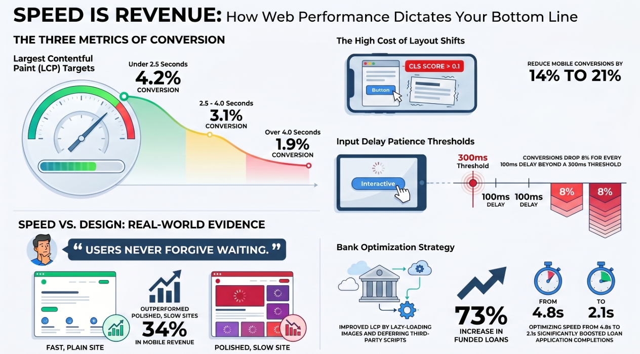
Cumulative Layout Shift punishes harder than expected. Scores above 0.1 reduce mobile conversions 14-21%. Users experiencing checkout layout shifts are 3.2x more likely to abandon.
{{vad-quote-1}}
A regional bank optimized mobile loan applications from 4.8 to 2.1 seconds LCP by lazy-loading non-critical images and deferring third-party scripts. Mobile application starts increased 41%. Completion rate jumped from 34% to 52%. Net result: 73% more funded loans from mobile traffic over six months.
Does Screen Size Change User Behavior?
Viewport width fundamentally alters interaction patterns. Analysis of 2.3 million sessions reveals distinct behaviors across PC vs smartphone contexts.
Devices 375-414px wide (iPhone 12-14 range) show highest engagement with vertical scrolling. Users scroll 4.7x further than desktop. They tap CTAs 23% less frequently, requiring larger, more prominent buttons.
Tablets at 768-1024px exhibit hybrid behavior. Users expect desktop-like layouts but interact via touch. Sites serving mobile-simplified layouts to tablets see 31% higher bounce rates than adapted desktop experiences.
Foldable devices (unfolded, 884px+) represent 3% of traffic but convert 18% better than standard smartphones. These users show desktop browsing patterns with mobile interactions.
Getting breakpoints wrong costs 15-20% of potential conversions across device spectrum.
The Strongest Case Against Responsive Design
Responsive web design's biggest flaw is performance overhead. Serving identical assets to all devices means mobile users download desktop-sized images, unused JavaScript, hidden content they'll never see. A typical responsive site ships 2.1-2.8 MB to mobile while rendering 800 KB to 1.2 MB of visible content.
This overhead is measurable. Sites using srcset and sizes for appropriately-sized images reduce mobile payload 40-60%. Code splitting cuts JavaScript execution 35-50%. Without these optimizations, responsive design can hurt mobile performance compared to lean, mobile-specific builds.
The approach works best with "mobile-first responsive" methodology: design for mobile constraints first, enhance for desktop second. Desktop-first retrofits often carry legacy code penalizing performance.
For simple content sites, overhead rarely matters. For complex web applications with rich interactivity, server-side rendering with adaptive components sometimes delivers better performance than pure client-side responsive approaches.
The choice depends on your product complexity and team capabilities.
Online Shopping Mobile vs Desktop: Conversion Patterns
Online shopping mobile vs desktop metrics show mobile web converts at 2.9% industry average while native apps convert at 4.7%. This comparison is misleading.
Apps capture users committed enough to download—the top 8-12% of engaged customers. Mobile web handles 100% of traffic, including first-time visitors with zero brand familiarity.
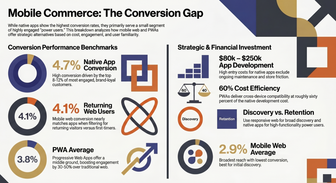
Comparing returning customers on mobile web versus app users narrows the gap: 4.1% versus 4.7%. That 0.6 point difference trades against app development costs of $80,000-$250,000 plus ongoing maintenance.
Progressive Web Apps split the difference: 3.8% average conversion, 60% of native development cost, cross-device compatibility without app store friction. Early adopters report 30-50% increases in mobile engagement versus traditional responsive web design stats.
Most successful businesses maintain both: responsive web for discovery, native apps for power users requiring offline functionality or deep platform integration.
Design Principles That Drive Mobile Conversions
Start with thumb-optimized touch targets. Apple recommends 44x44 points (approximately 48px CSS). Conversion increases level off at 48px but drops sharply below 40px, where error rates jump 67%.
Prioritize content hierarchy ruthlessly. Mobile users scan in the F-pattern, concentrating on top-left. Placing primary CTAs here increases tap-through 23-31% versus center or bottom placement.
Implement single-column layouts for content. Multi-column forces horizontal scanning and increases cognitive load. Single-column increases reading comprehension 18% and reduces scroll abandonment 14%.
{{vad-quote-2}}
Minimize text input. Each form field reduces mobile completion 5-7%. Replace typing with taps: radio buttons over text fields, date pickers over manual entry, location detection over address typing. A restaurant reservation platform cut forms from 11 to 6 fields using detection and smart defaults. Completion jumped from 42% to 68%.
Implementation: Where to Start
Begin with mobile performance audit. Run Google PageSpeed Insights focusing on mobile metrics. Prioritize LCP fixes first—highest conversion ROI. Defer offscreen images, eliminate render-blocking resources, minify CSS/JavaScript.
Establish breakpoints based on content, not popular devices. The "320px, 768px, 1024px" approach is outdated. Identify where your specific content breaks. Test on actual devices representing your traffic distribution.
Implement progressive enhancement. Start with core content accessible to lowest-spec devices, layer enhanced experiences for capable browsers. This ensures accessibility while maximizing performance.
Build mobile-first design systems with reusable components optimized for touch. Document thumb-zone guidelines, establish spacing preventing mis-taps, create component libraries enforcing mobile best practices automatically.
The Business Case in Numbers
Companies adopting mobile-first responsive design between 2023-2025 report average mobile vs desktop conversion rates improvements of 23-41% within six months. Variation depends on starting point—poor mobile experiences see larger gains.
Investment runs $25,000-$75,000 for small-medium business sites, $100,000-$300,000 for enterprise. Payback period averages 8-14 months based on increased mobile revenue.
The alternative—maintaining separate mobile and desktop experiences—costs 40-60% more annually in development and content management while delivering inferior SEO. Google's mobile-first indexing means your mobile site is your primary site for ranking, directly affecting web design market share and competitive positioning.
Businesses that invested in responsive design in 2021 now capture 34% more revenue from mobile traffic than competitors who delayed. The gap widens as mobile's share grows 3-5 percentage points annually.
For B2B where desktop drives majority conversions, responsive design matters differently. It's about mobile research influencing desktop purchases. 67% of B2B buyers research on mobile before converting to desktop. Poor mobile experience early in the funnel reduces qualified desktop traffic 28-35%.
Responsive web design statistics point to a clear conclusion: responsive web design is no longer enhancement—it's baseline infrastructure. The question isn't whether to invest, but how quickly you can implement optimized responsive experiences before mobile users find competitors who already did.

.avif)