
Brand typography speaks before your words do. When someone encounters your brand, the fonts you use create an immediate impression—trustworthy or flimsy, innovative or outdated, premium or budget. This silent language shapes how customers perceive your business within seconds.
For companies refreshing their visual identity, typography often gets treated as an afterthought. The logo gets redesigned. Colors get updated. Then someone asks: "What font should we use?" This backwards approach misses a critical truth. Your typography system forms the backbone of every customer touchpoint, from business cards to billboards to mobile apps. Get it wrong, and you're fighting an uphill battle for credibility.
More about the brand refresh:
Why Does Typography Define Your Brand?
Typography carries more weight than most brand owners realize. Research shows that font choice influences up to 90% of consumer purchasing decisions, often at the subconscious level. The typeface branding you select either reinforces your brand promise or contradicts it.
Think of a luxury jewelry brand using Comic Sans on their website. The disconnect creates instant distrust. The font screams "casual and careless" while the product demands "refined and exclusive." This mismatch costs sales before customers read a single product description.
Your typography system needs to accomplish three tasks: establish immediate recognition, communicate your brand personality accurately, and maintain consistency across every platform where customers encounter you.
Typography forms the foundation of every successful visual identity. When companies attempt to transform their market perception through an update of their broader corporate identity, integrating psychological research, competitive analysis, and rigorous A/B testing of the new typography system becomes critical. This methodological approach ensures that visual changes drive measurable engagement.
What Makes Typography Different from Fonts?
Most conversations about brand typography get muddled by imprecise language. Understanding the distinction between typeface and font matters for communicating with designers and making informed decisions.
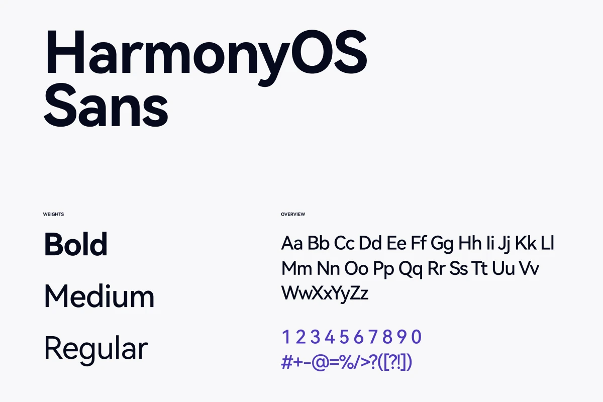
A brand typeface represents the design itself—the overall artistic vision and character set. Times New Roman is a typeface. Helvetica is a typeface. These are complete design systems with specific letterform characteristics.
A font refers to a specific variation within that typeface system. Times New Roman Bold 14pt is a font. Times New Roman Italic 12pt is a different font. Both belong to the same typeface family but serve different purposes in your typographic hierarchy.
Why does this distinction matter? When briefing designers or purchasing licenses, you need precision. Requesting "the Helvetica font" leaves room for confusion. Specifying "Helvetica Neue Light for body text at 16px and Helvetica Neue Bold for headings at 32px" eliminates ambiguity.
The Hidden Cost of Typography Decisions
Every font choice creates a ripple effect across your business operations. Licensing fees for premium typefaces range from $30 for a single user to $10,000+ for enterprise-wide deployment. Companies refreshing their brand often discover they need to purchase new licenses for every application, platform, and use case.
Web fonts present additional complexity. Some typefaces load slowly, increasing page abandonment rates. A study by Google found that pages loading in under three seconds see 32% lower bounce rates. Heavy font files sabotage this metric.
Mobile rendering adds another layer. Not all typefaces display consistently across iOS and Android devices. Your carefully selected accent font might default to system fonts on certain platforms, destroying your typographic consistency.
Budget these hidden costs early:
- Desktop licenses for design teams
- Web font licenses with monthly pageview limits
- App embedding licenses for mobile applications
- Print licensing for packaging and merchandise
- Social media usage rights for branded templates
How Your Target Audience Processes Type
Different demographics respond to typography in measurably distinct ways. Age, education level, and cultural background all influence font perception.
Research published in the Journal of Consumer Psychology demonstrates that Baby Boomers respond more favorably to serif typefaces, associating them with reliability and established credibility. The same serif fonts can make Gen Z audiences perceive brands as outdated or inaccessible.
Technical sophistication matters too. B2B audiences in engineering or finance expect clean, professional sans-serif typography that prioritizes information density. Consumer brands targeting emotional purchases often employ more expressive typefaces with stronger personality.
Cultural considerations extend beyond translation. Certain letterform characteristics carry different meanings across cultures. Angular, geometric fonts suggest precision and technology in Western markets but can feel cold or aggressive in Asian markets where rounded forms communicate harmony.
Test your typography with actual representatives from your target audience before finalizing decisions. Online surveys and A/B testing reveal real perception gaps between your intentions and customer reality.
{{vad-quote-1}}
Choosing Typography for Your Brand: The Psychology Behind Font Families
Typography styles trigger specific psychological responses rooted in decades of cultural conditioning and pattern recognition. Understanding these associations helps you select typefaces that align with your brand strategy.
Serif Fonts: Authority and Heritage
Serif fonts feature small decorative strokes at the ends of letterforms. These details originated with carved Roman inscriptions, creating strong associations with history, tradition, and permanence. Banks, law firms, and academic institutions favor serif fonts because they signal trustworthiness and established expertise.
The psychological mechanism works through familiarity. Western readers have encountered serif fonts in formal documents, books, and newspapers for centuries. This repetition creates neural pathways linking serif typography with serious, credible information.
Major brands like Rolex and The New York Times leverage this psychology deliberately. The typography choice reinforces their positioning as authoritative sources with deep heritage.
Sans-Serif Fonts: Innovation and Approachability
Sans-serif fonts remove the decorative strokes, creating cleaner, more geometric letterforms. This simplification emerged during the industrial revolution and became strongly associated with modernism, progress, and efficiency.
Tech companies like Apple and Google built their entire visual identities around sans-serif typography. The clean lines communicate innovation, forward-thinking, and user-friendliness. These fonts also render more clearly on digital screens, making them practical choices for web-heavy brands.
The psychological impact centers on reduction—stripping away unnecessary ornamentation to focus on essential function. Audiences interpret this as honesty, transparency, and contemporary relevance.
Script Fonts: Personality and Craft
Script typefaces mimic handwriting or calligraphy, introducing human warmth and personal touch. These fonts work exceptionally well for brands emphasizing artisanal quality, personal service, or emotional connection.
The psychological mechanism involves personalization. Handwritten elements feel intimate and unique in an increasingly automated world. Wedding planners, boutique bakeries, and luxury beauty brands frequently employ script typography to communicate care and attention to detail.
The tradeoff: script fonts sacrifice legibility, especially at small sizes or on screens. Reserve them for accent use in logos or headlines rather than body text.
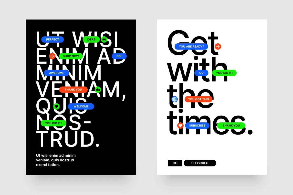
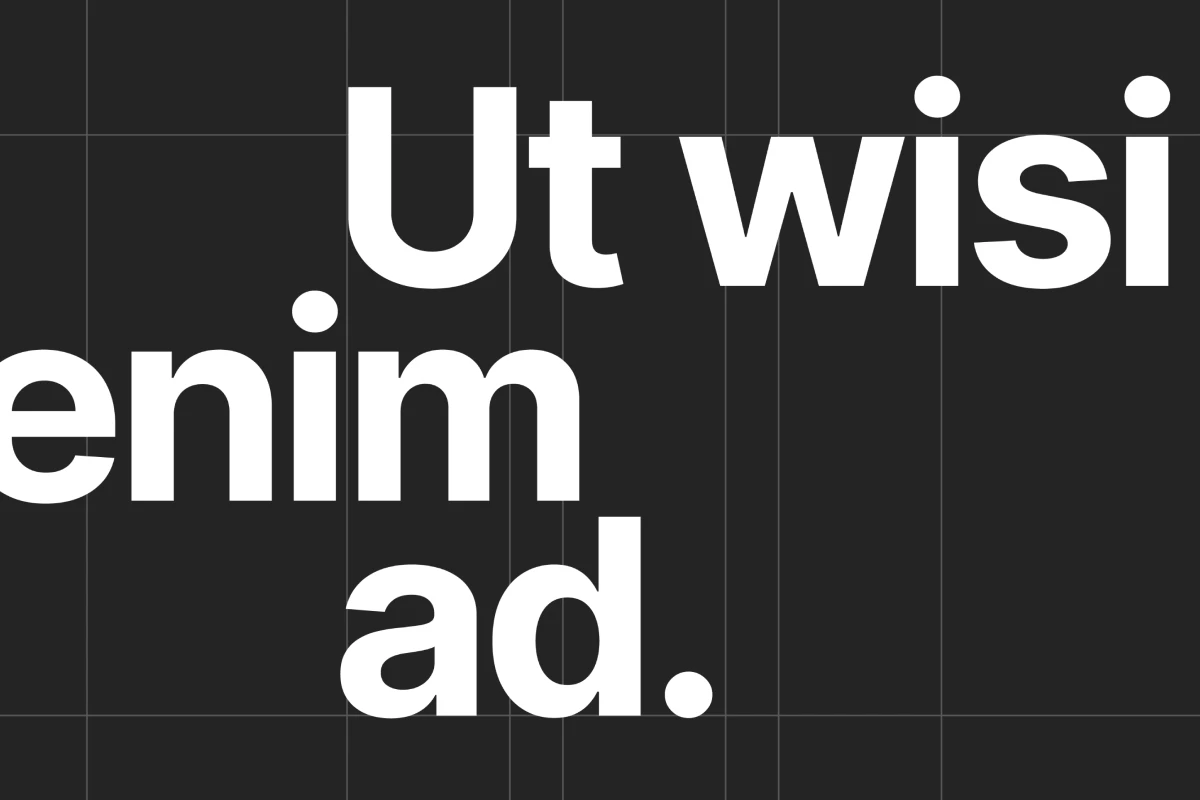
Display Fonts: Attention and Differentiation
Display typefaces prioritize visual impact over pure readability. These highly stylized fonts exist to grab attention and create memorable first impressions. Entertainment companies, restaurants, and children's brands often choose display typography to project creativity and fun.
The danger lies in overuse. Display fonts dominate visual space, creating fatigue if applied too broadly. Limit them to primary headlines or brand marks where maximum differentiation matters most.
How Do You Build a Typography System That Actually Works?
Effective typographic branding requires a structured hierarchy—a system of rules defining which fonts appear where and how they interact. This framework prevents chaos while maintaining flexibility for different applications.
Step 1: Define Your Primary Typeface
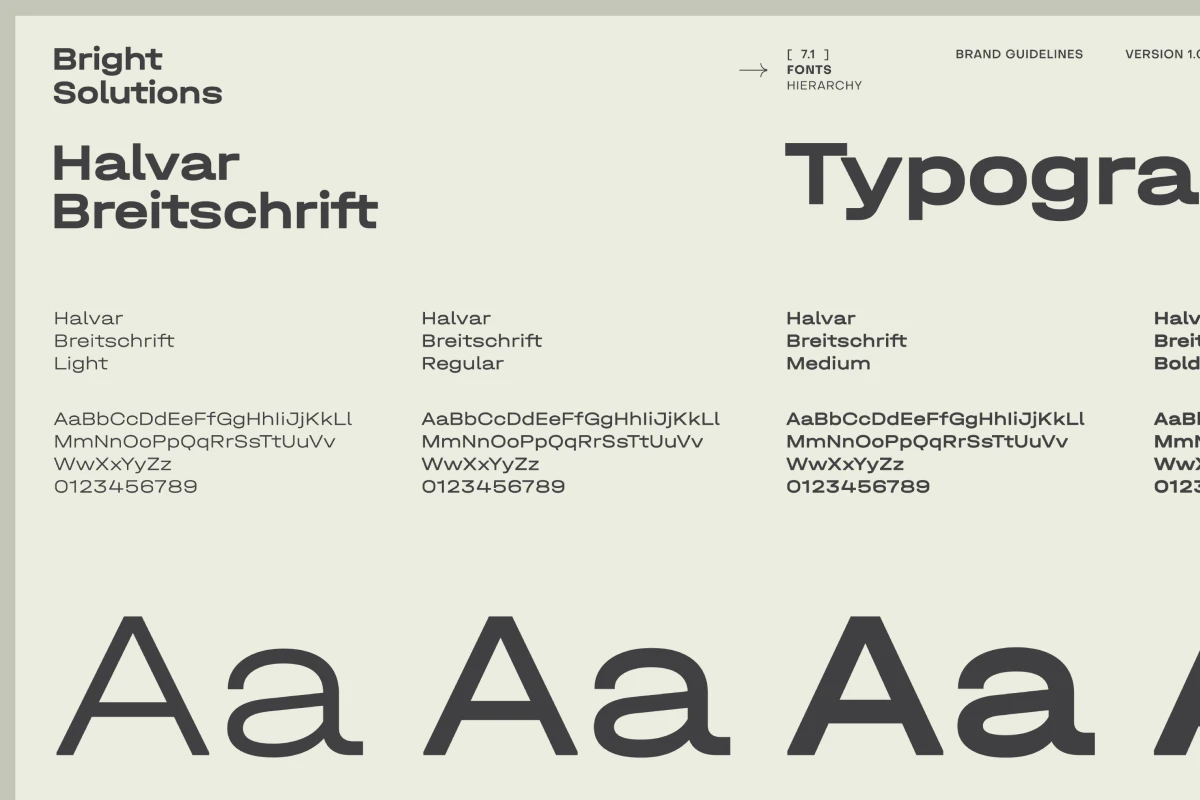
Your primary typeface handles the heavy lifting across most brand applications. This workhorse font appears in body text, navigation menus, product descriptions, and general communication. Choose a typeface with extensive font weights options (Light, Regular, Medium, Bold, Black) to create variety without switching fonts.
Evaluate primary typeface selection candidates based on these criteria:
- Legibility at small sizes (10-12pt for print, 14-16px for web)
- Multiple weights and styles available within the family
- Technical versatility across print, web, and mobile platforms
- Licensing costs appropriate for your scale of operations
- Character support for all languages you operate in
IBM Plex is an excellent example of a primary typeface system. The family includes Sans, Serif, and Mono variants with identical proportions, allowing seamless mixing while maintaining visual cohesion.
Step 2: Select Your Secondary Typeface for Contrast
Your secondary typeface creates visual hierarchy and adds personality. This font appears in headlines, subheadings, pull quotes, and featured content. The goal: sufficient contrast with your primary typeface to create clear distinction without creating visual chaos.
The contrast principle relies on opposition. If your primary typeface is a neutral sans-serif, pair it with an expressive serif or slab serif. If your primary is a traditional serif, pair with a clean sans-serif.
Balance similarity and difference. Your typefaces should share some characteristics (x-height, stroke weight, geometric proportions) while differing in others (serif treatment, overall character, emotional tone). This creates harmony without redundancy.
Step 3: Establish Your Accent Typeface for Special Applications
Some brands benefit from a third typeface reserved for special emphasis—logos, campaign headlines, or branded merchandise. This accent font can take more creative risks since it appears sparingly.
Accent typefaces often include display fonts, custom fonts, or highly stylized options that would overwhelm if overused. The limited application preserves their impact.
Many successful brands operate with just two typefaces. Add a third only if you have a clear, strategic reason. More fonts increase complexity and risk inconsistency.
The Engineering Tradeoffs of Font Selection
Every typography decision involves compromise. No single typeface excels at everything. Understanding these tradeoffs helps you make informed choices aligned with your priorities.
Legibility vs. Personality
Highly legible fonts tend toward neutrality. They communicate information efficiently but project less distinctive character. Choosing Helvetica gives you universal readability but minimal differentiation from competitors using similar neutral sans-serifs.
Fonts with strong personalities sacrifice some legibility. The decorative elements that make a typeface memorable also introduce complexity that slows recognition. Choosing font for brand identity like Cooper or Goudy Old Style gives you distinctive brand character but reduces reading speed at small sizes.
Use personality-rich fonts for headlines where legibility demands are lower, and reserve neutral fonts for body text where sustained reading happens.
Versatility vs. Uniqueness
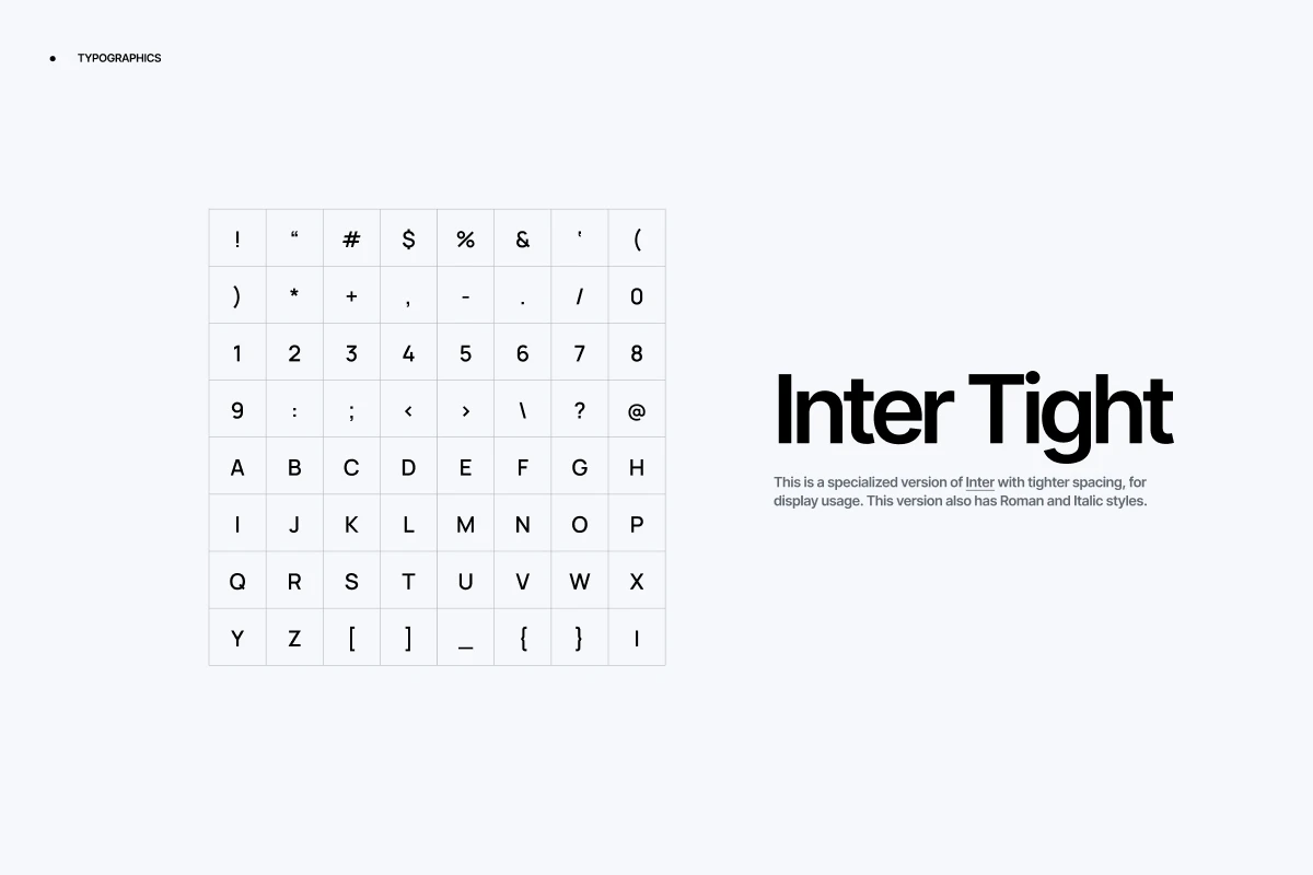
Typefaces with extensive families (20+ weights and styles) offer tremendous versatility for creating hierarchy without switching fonts. Inter, Source Sans Pro, and Work Sans provide this flexibility.
Custom or limited-release typefaces create stronger differentiation but restrict your options. Fewer weights mean more creative problem-solving to establish hierarchy, often requiring size variation or color coding instead of weight changes.
Many brands combine a versatile primary typeface with a unique secondary font, getting utility from one and differentiation from the other.
Print Optimization vs. Screen Optimization
Fonts designed for print often feature fine details and delicate serifs that disappear or blur on screens. Garamond looks elegant in printed annual reports but loses clarity on mobile devices.
Fonts optimized for screens use larger x-heights, wider spacing, and simplified details to maintain legibility on low-resolution displays. But these same characteristics can feel clunky or oversized in print applications.
Select primary typefaces designed with cross-platform compatibility, or specify different fonts for print vs. digital applications within your brand guide typography.
Font Pairing: What Combinations Look Professional?

Font pairing successfully requires understanding three technical principles: contrast, complementarity, and coherence.
Contrast Creates Hierarchy
Effective font pairs differ enough for readers to immediately recognize their distinct roles. If your headline font and body font look too similar, the hierarchy collapses. Readers can't quickly distinguish what information matters most.
Create contrast through:
- Weight variation: Pair a bold display font with a light body font
- Classification mixing: Combine serif headlines with sans-serif body text
- Proportional differences: Match a narrow, condensed font with a wider, more open font
- Character differentiation: Pair geometric fonts with humanist fonts
The coffee chain Blue Bottle demonstrates excellent contrast. Their bold, geometric sans-serif logo (Brandon Grotesque) pairs with a clean serif for menu items (Mercury Text), creating clear visual separation between brand identity and product information.
Complementarity Requires Shared DNA
Contrasting fonts still need connection points—shared characteristics that make them feel intentionally paired rather than randomly assembled. This creates visual harmony despite the differences.
Look for shared attributes:
- Similar x-height proportions
- Comparable stroke weight in medium weights
- Matching geometric foundations (both geometric or both organic)
- Similar historical periods (both modernist or both classical)
Fonts from the same designer often pair well because they share underlying design philosophy. Hoefler & Co.'s Gotham and Sentinel work beautifully together because both fonts emphasize American vernacular traditions despite one being sans-serif and one being serif.
Coherence Depends on Consistent Application
Even perfectly paired fonts fail if applied inconsistently. Your brand font guidelines must specify exactly when each font appears and at what sizes, weights, and colors.
Define clear rules:
- Primary headlines: Font A, Bold, 42pt
- Secondary headlines: Font B, Regular, 28pt
- Body text: Font A, Regular, 16pt
- Captions: Font A, Light, 12pt
The outdoor brand Patagonia maintains coherence by strictly limiting font usage. Their brand guidelines specify exact point sizes and weights for every application, eliminating guesswork and maintaining consistency across thousands of pieces of marketing material.
Evolution of Typography in Branding
Typography trends cycle through periods of complexity and simplification, reflecting broader cultural movements. Understanding this evolution reveals why certain font choices feel contemporary while others feel dated.
The Decorative Era (Pre-1950s)
Early brand typography emphasized ornamental details. Limited printing technologies meant brands differentiated through intricate lettering and decorative flourishes. Beer labels, tobacco packaging, and early automotive brands featured elaborate script fonts and hand-drawn letterforms.
These ornate styles reproduced poorly at small sizes and couldn't scale across diverse applications. Brands needed simplified alternatives for newspaper ads and outdoor signage.
The Swiss Modernist Revolution (1950s-1970s)
The International Typographic Style emerged from Switzerland, championing clean sans-serif fonts, grid-based layouts, and systematic approaches. Helvetica became the defining typeface of this movement, adopted by airlines, corporations, and governments worldwide.
This represented a pendulum swing toward maximum simplification. Designers removed all decoration, focusing purely on legible information delivery. Brands like American Airlines and Lufthansa built entire identities around Swiss typography principles.
By the 1980s, this aesthetic felt cold and institutional. Consumers craved more emotional connection and personality.
The Digital Explosion (1990s-2000s)
Desktop publishing democratized typography. Suddenly anyone could access hundreds of fonts. This abundance led to chaotic experimentation. Brands mixed typefaces indiscriminately, often using five or more fonts in a single brochure.
The defining failed experiments: Excessive use of grunge fonts, inappropriate application of comic or novelty typefaces to serious businesses, and over-reliance on WordArt effects.
Design leaders pushed back toward restraint, establishing the "2-3 font maximum" guideline that now dominates brand guidelines.
The Screen-First Era (2010s-Present)
Mobile devices forced typography evolution. Fonts to use for logos and body text needed to remain legible at tiny sizes on low-resolution screens. This drove development of screen-optimized typefaces with larger x-heights, wider spacing, and simplified details.
Google Fonts and Adobe Fonts provided free access to high-quality typefaces, raising baseline expectations. Brands could no longer justify poor typography due to cost constraints.
Current solutions elegantly solve predecessor problems by offering variable fonts—single files containing multiple weights and styles that load faster and adapt to different contexts. This technological advance enables sophisticated typography hierarchies without performance penalties.
Critical Mistakes That Destroy Typography Systems
Three typography mistakes appear repeatedly in brand refreshes, each undermining consistency and professionalism.
Mistake 1: Mixing Too Many Fonts Across Platforms
Some brands use different fonts for email, website, social media, and print, believing each platform needs unique treatment. This fragmentation destroys brand recognition.
Platform limitations or convenience. A designer chooses one font for the website because it's free on Google Fonts, then picks a different font for print because they already own that license. The marketing team selects yet another font for email because their template came with it pre-installed.
Customers encounter your brand across 15-20 touchpoints before purchasing. If your typography changes at each touchpoint, you're resetting brand recognition every time. Research shows consistent brand presentation increases revenue by 33%. Font inconsistency directly contradicts this principle.
Your typography system might be 70% effective on your website and 70% effective in print, but if they're different systems, you get 0% cross-platform reinforcement. Consistent typography that's 60% effective everywhere outperforms this fragmented approach because recognition compounds.
Fix this by establishing a primary typeface that works across all platforms, even if it means compromising slightly on perfect optimization for each individual channel.
Mistake 2: Choosing Fonts Based Solely on Personal Preference
Decision-makers sometimes select typography because they personally like a font, ignoring whether it fits the brand strategy or target audience.
Fonts trigger subjective emotional responses. The CEO's favorite font reminds her of her childhood. The designer loves a typeface because it won awards. These personal connections override strategic thinking.
A B2B software company targeting enterprise IT departments chose a playful, rounded sans-serif because the founder found traditional fonts "boring." Customer research revealed that this typography choice made prospects question the company's technical credibility. Switching to a more conventional typeface increased trial signups by 23% in the following quarter.
Your font for brand identity exists to communicate with customers, not please internal stakeholders. Font selection requires research and testing with actual audience members.
Fix this by defining brand attributes first (trustworthy, innovative, accessible, premium), then evaluating fonts against those attributes using audience feedback rather than personal preference.
Mistake 3: Ignoring How Fonts Render at Different Sizes
Many brands finalize typography decisions after viewing samples at headline size, never testing how fonts perform at actual body text size or on mobile screens.
Design reviews happen on large monitors or in conference room presentations. Fonts that look sophisticated at 48pt become illegible at 14px. Light font weights look elegant in mockups but disappear on actual screens.
These typography failures are entirely preventable with a data-driven approach. During a systematic visual modernization, implementing a validation framework that tests every typographic decision against real user behavior before launch is an industry standard. This minimizes the risk of costly post-launch corrections and ensures immediate improvements in cognitive fluency.
A retail brand launched a redesigned website with an ultra-light sans-serif body font that tested beautifully on designers' calibrated monitors. Real-world analytics showed 40% of mobile users immediately increased system font size (a clear signal of legibility problems) and average session duration dropped 22%. The font's low contrast between letters made sustained reading uncomfortable.
Fixing this problem post-launch required emergency redesign work, additional development costs, and explained lost revenue during the three weeks the poor typography remained live.
Fix this by testing all typography decisions at actual implementation sizes, on actual devices, under realistic lighting conditions before finalizing the system.
{{mike-quote-1}}
Viewing Typography Through Your Competitors' Lens
Typography decisions exist within a competitive context. Your fonts don't communicate in isolation—customers compare your visual identity against alternatives in your category.
Analyze typography choices across your top 5-10 competitors. Look for patterns:
- Are most competitors using serif or sans-serif primary typefaces?
- Do they favor neutral, workhorse fonts or distinctive, personality-driven choices?
- How many fonts do their brand systems typically include?
- What level of formality or casualness do their typographic choices project?
These patterns reveal category norms. Breaking from norms creates differentiation but risks appearing unprofessional or confusing. Conforming to norms provides familiarity but makes standing out harder.
Strategic typography balances these tensions. If every competitor uses conservative serif fonts, a clean sans-serif creates immediate visual differentiation while maintaining professionalism. If competitors all use trendy geometric sans-serifs, a well-executed serif approach positions you as more established and trustworthy.
Conduct this competitive audit during your typography planning phase, not after finalizing decisions. Understanding the visual landscape shapes better strategic choices.
When Unconventional Typography Actually Works
Most guidance emphasizes typography consistency, professional choices, and strategic restraint. But successful brands sometimes break these rules deliberately.
The Case for Typography Rule-Breaking
Brands operating in saturated, undifferentiated markets sometimes need shock value. Using unexpected or technically "wrong" typography creates memorability that perfect, polished choices cannot achieve.
The craft beer brand BrewDog built their identity around deliberately aggressive, punk-aesthetic typography that violates standard legibility principles. Their cans feature tightly-tracked, condensed fonts that professional designers would typically reject. This approach works because it perfectly aligns with their anti-establishment brand positioning.
The restaurant chain Chipotle initially used a rough, hand-drawn wordmark that defied clean corporate typography standards. This choice reinforced their positioning around handmade food and artisanal preparation in contrast to fast-food competitors using slick, processed aesthetics.
When Conventional Wisdom Fails
Unconventional typography succeeds when three conditions align:
- Strategic Coherence: The typography choice directly reinforces a differentiated brand positioning
- Category Disruption: Competitors follow similar conventions, creating opportunity for contrast
- Consistent Application: The unconventional approach gets applied systematically, not randomly
These remain exceptions, not rules. For every BrewDog success story, dozens of brands fail by choosing unconventional typography without strategic justification.
Most brand refreshes benefit from proven typography principles. Test unconventional approaches only after mastering conventional ones.
Brand Guide Fonts: Deep Dive Into Typography Licensing Models
Typography licensing creates hidden complexity in brand refreshes. Understanding these models prevents expensive mistakes.
Desktop Licensing
Covers font use on individual computers for design work. A desktop license for 5 users typically costs $200-800 per typeface family. These licenses don't cover web, app, or broadcast use.
Web Font Licensing
Separate licenses required for embedding fonts on websites, usually priced by monthly pageviews. A site with 100,000 monthly pageviews might pay $20-100/month per typeface. Exceeding pageview limits triggers overage fees or service interruption.
App Embedding Licenses
Mobile and desktop applications need specific embedding rights. These licenses often require annual renewals and restrict the number of app installs. Costs range from $500-5,000 per platform (iOS, Android, etc.).
Broadcast Licenses
Video content, streaming platforms, and broadcast advertising require separate licensing. These specialized licenses can cost $1,000-10,000+ depending on distribution scope.
Open Source Alternatives
Google Fonts and Adobe Fonts offer free licensing across most use cases, dramatically reducing costs. The tradeoff: less uniqueness since these popular fonts appear across millions of websites.
Calculate total 5-year typography costs before finalizing font choices. A free Google Font might serve your needs as well as a $15,000 custom typeface license.
{{vad-quote-2}}
Case Study—Typography Rescue for a Regional Hospital Network
A 12-hospital healthcare network approached our agency after their DIY brand refresh created consistency problems. Different departments used different fonts across web, print, signage, and digital ads. Patient surveys revealed confusion about whether materials came from the same organization.
The Problem:
- Marketing used Montserrat (free Google Font) on the website
- Print team used Futura (licensed font) in brochures
- Signage used Arial (system font) by default
- No documented guidelines existed
The Solution Process:
We started by interviewing stakeholders about why each department chose their fonts. Marketing selected Montserrat for budget reasons. Print chose Futura because it was "medical-looking." Signage defaulted to Arial due to vendor limitations.
Next, we tested fonts with patients across age groups. Older patients (65+) strongly preferred serif fonts, associating them with established healthcare institutions. Younger patients (25-45) showed no preference between serif and sans-serif but rated legibility as their top priority.
We established a two-font system:
- Primary: Source Serif Pro (free, open-source) for body text and general communication
- Secondary: Inter (free, open-source) for digital interfaces and wayfinding
Both fonts offered extensive weight options, cross-platform compatibility, and free licensing. The serif/sans-serif combination provided a clear hierarchy.
The Measurable Results:
Six months after implementing the typography system:
- Brand recognition in patient surveys increased 41%
- Website bounce rate decreased 18% (improved readability)
- Internal print costs dropped 28% (eliminated ad-hoc font licensing)
- Design production time decreased 35% (clear guidelines reduced decision-making)
The total typography overhaul cost $15,000 in design consulting fees but eliminated ongoing licensing costs of approximately $4,000 annually and generated measurable improvements in brand performance.
Typography Hierarchy as Communication Architecture
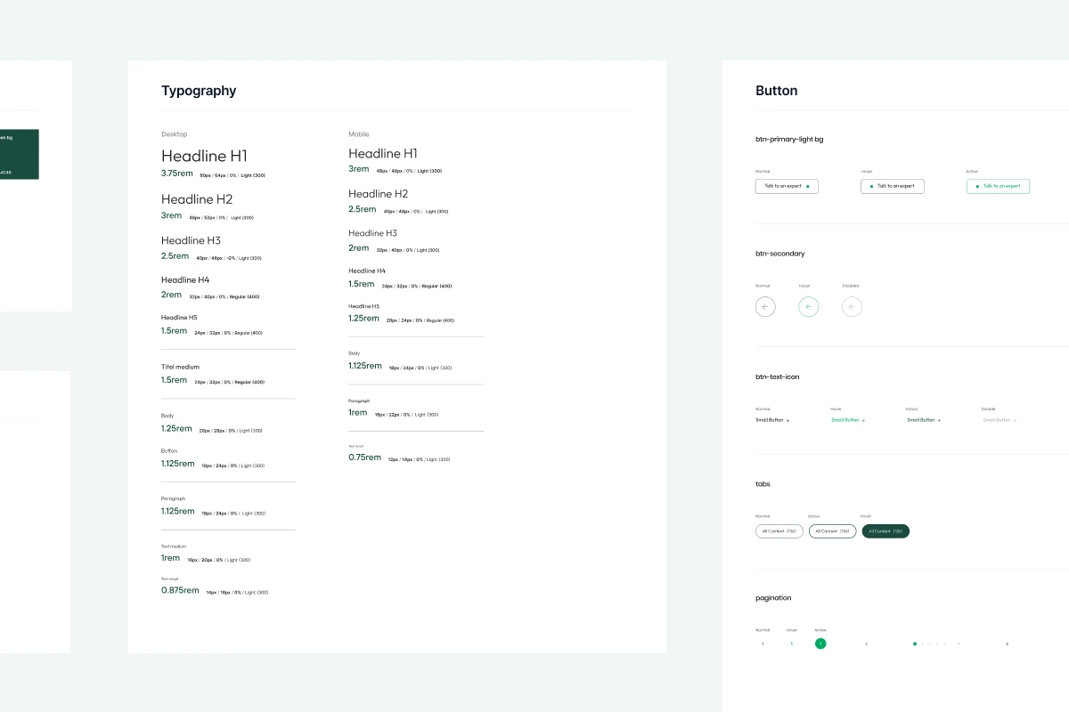
Think of typography hierarchy like a guided tour through information. Your font in branding choices create a path that leads readers from most important to least important content.
Establish clear levels in your hierarchy:
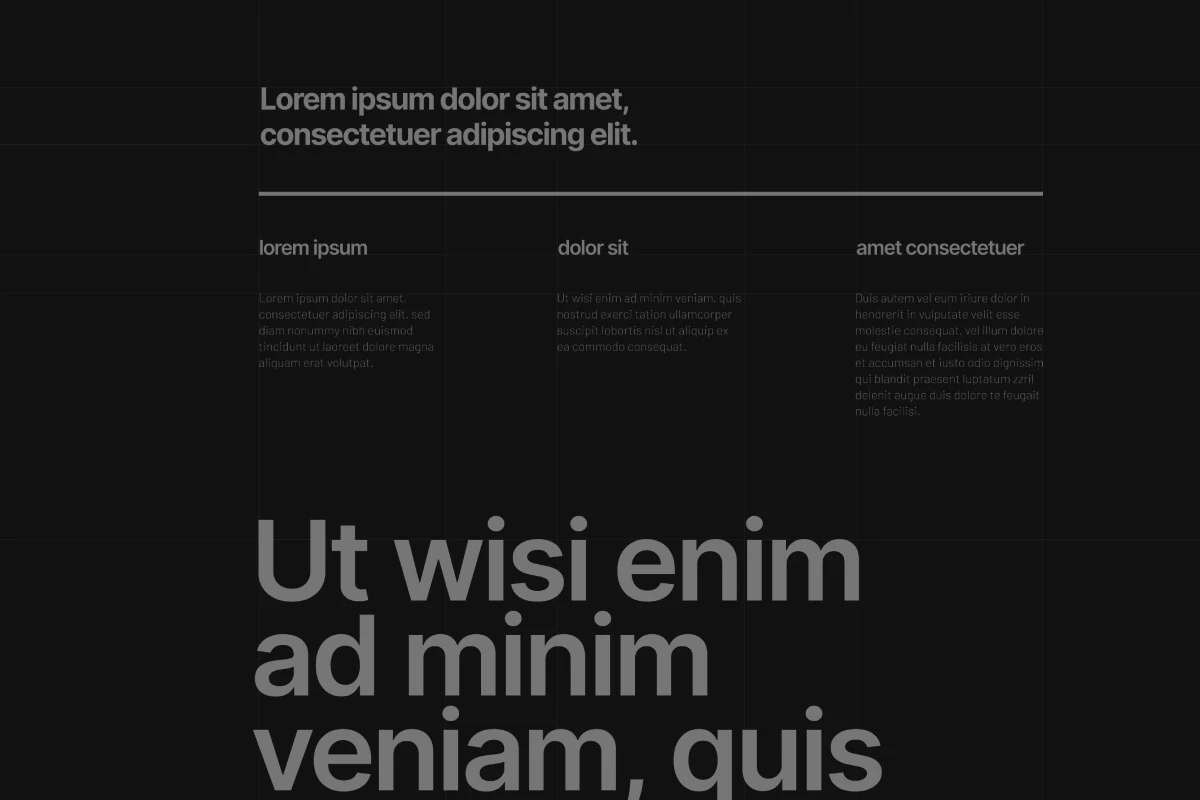
Level 1: Primary Headlines (H1)
Your biggest, boldest text style. This appears once per page and communicates the single most important message. Use your secondary typeface here if it has a strong personality, or use the heaviest weight of your primary typeface.
Level 2: Section Headlines (H2)
Breaking major topics into digestible chunks. These headlines appear multiple times per page. Use medium or bold weight of your primary typeface, sized 1.5-2x your body text size.
Level 3: Subsection Headlines (H3)
Detailed breakdowns within sections. Use regular or medium weight of your primary typeface, sized 1.25-1.5x your body text.
Level 4: Body Text
Where readers spend most of their time. Use the regular weight of your primary typeface at optimal reading size (16-18px for web, 10-12pt for print). Never sacrifice legibility here for style.
Level 5: Supporting Text
Captions, footnotes, auxiliary information. Use light or regular weight of your primary typeface, slightly smaller than body text but never smaller than 12px web or 8pt print.
Maintain consistent size ratios between levels. If your H1 is 48px and H2 is 32px, maintain this 1.5x ratio throughout your materials. This mathematical consistency creates professional polish.
Optimizing Typography for Digital Performance
Typography impacts website performance metrics in measurable ways. Slow-loading fonts increase bounce rates. Poor legibility reduces time on page. These technical considerations matter as much as aesthetic ones.
Font File Optimization
Standard font files range from 50KB to 500KB. Loading multiple weights and styles can exceed 2MB total, significantly slowing page load times.
Optimize by:
- Loading only the weights and styles you actually use
- Implementing font subsetting (removing unused characters)
- Using variable fonts that contain multiple weights in a single file
- Enabling compression and browser caching
Font Loading Strategy
Browsers can display text using three strategies when custom fonts load:
- FOIT (Flash of Invisible Text): Text remains invisible until custom fonts load
- FOUT (Flash of Unstyled Text): Text displays in fallback fonts, then swaps to custom fonts
- Progressive Enhancement: Display text immediately, swap fonts seamlessly when ready
Choose FOUT or progressive enhancement for better user experience. Never make users wait for fonts to read content.
Fallback Font Stack
Always specify fallback fonts that match your custom fonts' proportions. This prevents layout shifts when fonts load or fail.
Good fallback stack example:
font-family: 'Inter', -apple-system, BlinkMacSystemFont, 'Segoe UI', Roboto, Helvetica, Arial, sans-serif;
This loads Inter (custom font), then falls back through system fonts with similar proportions if Inter fails.
Building Your Typography Documentation
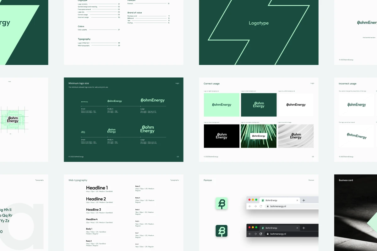
Brand guidelines mean nothing if nobody uses them. Create documentation that designers, marketers, and vendors can actually reference.
Essential Documentation Elements:
- Typography Overview. One-page summary showing all approved typefaces with example text at multiple sizes. Make this visually scannable so users can quickly identify correct fonts.
- Usage Matrix. Table defining exactly which font, weight, and size applies to each application:
- Print: Business cards, brochures, signage, packaging
- Digital: Website, email, social media, display ads
- Internal: Presentations, documents, spreadsheets
- Licensing Information. Where to download fonts, what license restrictions apply, who to contact with questions. Include purchasing links for any paid fonts.
- Pairing Rules. Visual examples showing correct and incorrect font combinations. Explain why certain pairings work and others fail.
- Technical Specifications. Exact values for web (px, rem), print (pt), and responsive breakpoints. Include line height, letter spacing, and paragraph spacing values.
- Accessibility Requirements. Minimum font sizes, color contrast ratios, and guidelines for ensuring readable typography for users with visual impairments.
- Make this documentation available as both PDF and web-based format. The PDF allows offline reference, while the web version enables searchability and faster updates.
Typography Testing Framework
Before launching your new typography system, validate it against real-world conditions:
Legibility Testing
Display body text samples at actual size on various devices (desktop monitors, tablets, phones). Ask test users to read passages and measure comprehension speed. Compare against your current typography. The new system should maintain or improve reading speed.
Size and Scale Testing
Print materials at actual size. View digital designs at 100% zoom on target devices. What looks perfect at 200% zoom in design software often fails at actual implementation size.
Technical Testing
Check font rendering across browsers (Chrome, Firefox, Safari, Edge) and operating systems (Windows, macOS, iOS, Android). Some fonts render beautifully on macOS but appear jagged on Windows.
Accessibility Audits
Verify color contrast ratios meet WCAG 2.1 AA standards (minimum 4.5:1 for normal text, 3:1 for large text). Test with screen readers to ensure font choices don't interfere with accessibility technology.
Performance Testing
Measure actual page load times with your new fonts. Compare against alternatives. If custom fonts increase load time by more than 0.5 seconds, reconsider your choices or optimize implementation.
Document test results and keep them with your brand guidelines. This creates accountability and provides baseline metrics for future typography evaluations.
Your Path Forward
Typography shapes brand perception more powerfully than most business leaders recognize. The typographic elements you select—and how systematically you apply them—determine whether customers perceive your company as trustworthy or questionable, innovative or outdated, premium or bargain.
Start your typography refresh by auditing your current state. Document every font currently in use across all platforms. Calculate the true cost of your current licensing. Survey customers about their perception of your brand's visual identity.
Then build your typography system methodically:
- Define your primary typeface for versatility and legibility
- Select a secondary typeface for contrast and personality
- Establish a clear hierarchy with specific size and weight rules
- Document everything in accessible brand guidelines
- Test ruthlessly across devices, platforms, and user groups
- Train your team and vendors on proper implementation
Typography exists to serve your audience. Every decision should prioritize their needs over internal preferences. The most beautiful font means nothing if customers can't read it comfortably or if it contradicts your brand promise.
Start small if necessary. Fixing typography inconsistencies across just your website and email can generate measurable improvements in engagement metrics. Build momentum with quick wins, then expand the system across all touchpoints.
Your brand deserves typography that works as hard as you do through strong graphic design principles. Make it count.