Your competitor just updated their logo. It looks sharper. Their website loads faster. Their Instagram feels cohesive. Meanwhile, your company still uses the color palette from 2019 and a tagline that doesn't reflect what you actually do anymore. Customers scroll past. Prospects choose someone else.
A brand refresh updates your visual identity and messaging without erasing your history. This guide shows you exactly how to execute one in 2026—from spotting the warning signs to measuring actual results.
More about the brand refresh:
- The Brand Audit Process: A Practical Guide for Business Leaders
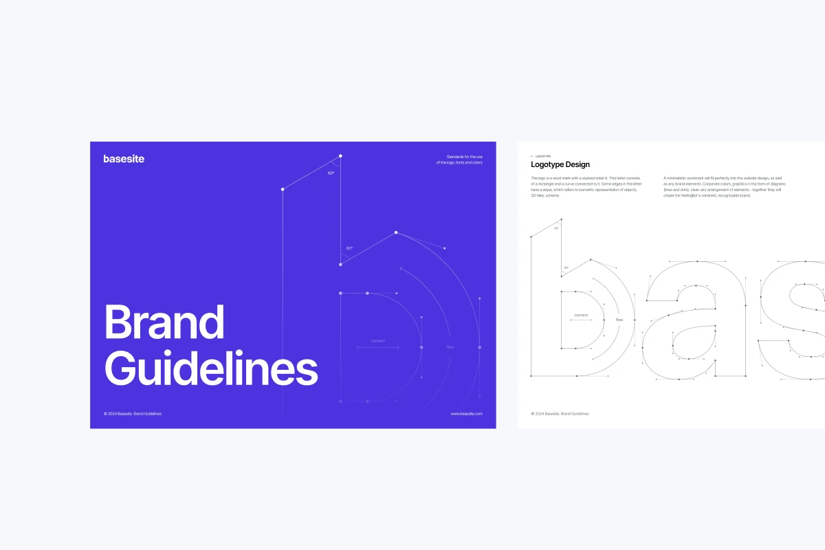
- Brand Typography: Your Visual Voice in the Market
What Is a Brand Refresh?
It's a strategic modernization of specific visual and messaging elements while preserving your core identity. You're not rebuilding from zero. You're updating your logo refinement, color palette adjustments, typography choices, or messaging tone to match current market expectations.

The scope separates a refresh from a complete rebrand. Refreshes modify selected elements—your logo gets simplified, your color palette gains new shades, your typography becomes more legible on mobile. Your mission, values, and positioning stay intact. In the past five years, 78% of major brands have undertaken logo redesigns to refresh their image and stay relevant in the market, showing this approach has become standard practice.
Think of Instagram's 2016 logo evolution. They moved from a detailed vintage camera to a simplified gradient icon. Everyone still recognized it. The core identity remained. Only the execution changed.
How We Got Here: The Evolution of Brand Updates
Fifteen years ago, brands treated updates like replacing wallpaper. Graphic designers created new logos in isolation. Marketing teams received finished files and scrambled to implement them across disconnected touchpoints. The fundamental flaw: treating brand identity refresh as decoration rather than strategy.

Two "solutions" emerged and failed. First, template-driven approaches where brands adopted identical minimalist styles, producing what experts call "blanding." Second, trend-chasing refreshes that prioritized looking current over staying authentic. Brands adopted neon gradients in 2018 and discarded them by 2020, confusing customers.
Modern approaches solve these problems through research-first methodology. Today's process begins with customer interviews and competitive analysis before touching design tools. Strategic repositioning drives visual changes, not the reverse. The refresh becomes a coordinated transformation that strengthens recognition rather than diluting it.
Why Your Brand Might Need an Update in 2026
Your visual identity feels dated compared to competitors who've modernized. 94% of consumers are more loyal to brands with consistent communication across all company departments, and outdated branding signals inconsistency.
Your audience has shifted. The people buying from you today have different expectations than your original customers. You've added services your current brand doesn't reflect. Your logo looks fuzzy on mobile or fails to scale across platforms.
Declining engagement signals deeper problems. When social media metrics drop or website bounce rates climb, your brand might be failing to connect. 60% of consumers avoid companies with weird or unappealing logo designs, even if they have good reviews.
Consider these specific scenarios:
- Your B2B software originally targeted startups but now serves enterprise clients
- Your retail brand expanded from local to national markets
- Your service business merged with another company
- Negative reviews mention your brand feels "cheap" or "unprofessional"
The threshold: when three or more signals appear simultaneously, delaying costs more than executing.
Brand Refresh vs. Rebrand: What's the Difference?
A brand update modifies selected elements. A rebrand creates an entirely new identity from foundation to finish.
The key question: does your current foundation still support your business goals? If yes, refresh your brand. If no, rebrand.
Apple provides the classic example. They evolved their rainbow logo to monochrome without abandoning the iconic apple shape. 74% of the S&P 100 companies have rebranded within their first seven years of operation, showing even successful businesses use strategic updates for growth.
{{mike-quote-1}}
Step 1: Research What's Actually Broken
You cannot refresh what you don't understand. Discovery prevents expensive mistakes disguised as creative decisions.
Survey 30-50 current customers asking three questions:
- How would you describe our brand to a friend?
- What feeling does our visual identity create?
- What's one thing you'd change about how we present ourselves?
Their answers reveal gaps between your intentions and their reality. 71% of audiences can recall the brand featured in branded content without prompting, so understanding existing perception matters before changing it.
Conduct competitive analysis next. Identify your five closest competitors and three aspirational brands from adjacent industries. Screenshot their websites, social media, and marketing materials. Map their visual patterns: color schemes, typography choices, photography styles. Look for overcrowded spaces where differentiation matters most.
Audit every customer touchpoint. Your brand appears on websites, social media, email signatures, business cards, presentations, packaging, and signage. Photograph everything. Note inconsistencies. Calculate how many touchpoints need updating—this number drives budget and timeline decisions.
The discovery phase spans two weeks. Rush it and you'll refresh toward wrong objectives.
Step 2: Define Your Brand Refresh Strategy
Your foundation includes mission, vision, values, positioning, and key messaging. These inform all future communication and form the backbone of any successful brand refresh.
Your mission statement answers: Why does your business exist beyond making money? Keep it concrete. "We help small manufacturers reduce waste by 40%" beats "We're passionate about sustainable solutions."
Your positioning statement clarifies who you serve and why you're different. Fill in this framework: For [target customer] who [specific need], our [product/service] is the [category] that [unique benefit]. Unlike [competitor approach], we [key differentiator].
Test positioning against three criteria. First, does it reflect reality? Second, does it matter to customers? Third, can you defend it with evidence?
This strategic work takes 1-2 weeks but saves months of revision later. Design without strategy produces pictures that don't perform.
Many businesses struggle with the strategic foundation phase because it requires an objective, unbiased external perspective. If internal teams find it difficult to articulate positioning or identify core differentiators, partnering with a specialized design team can accelerate the alignment process. Typically, integrating external stakeholder interviews and competitive audits at this stage saves companies 3-4 weeks of internal friction.
Step 3: Execute Your Visual Identity Change
Your visual identity includes every element customers see: logo, typography, color palette, imagery style, and graphic elements. This visual identity change must align with your strategic foundation.
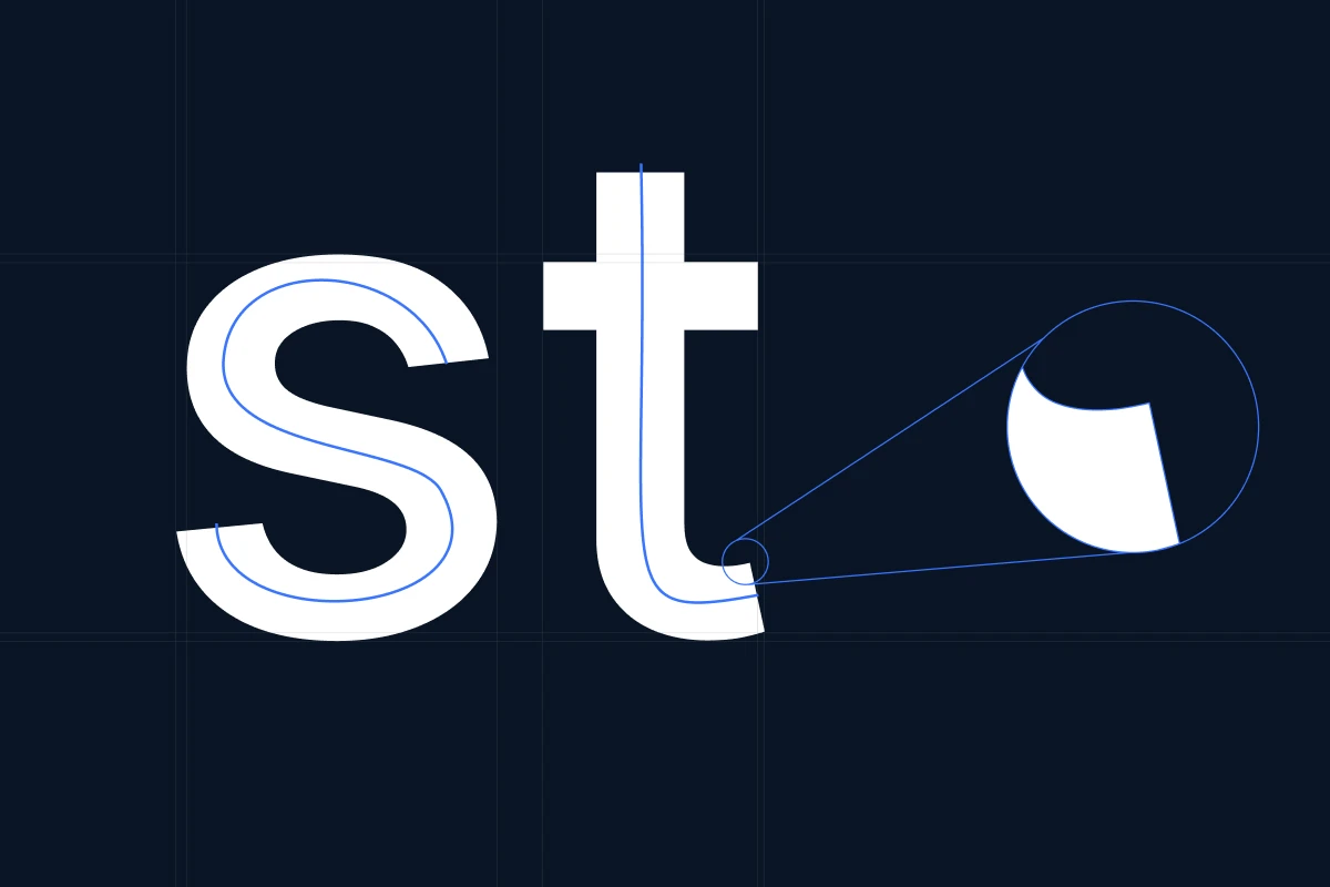
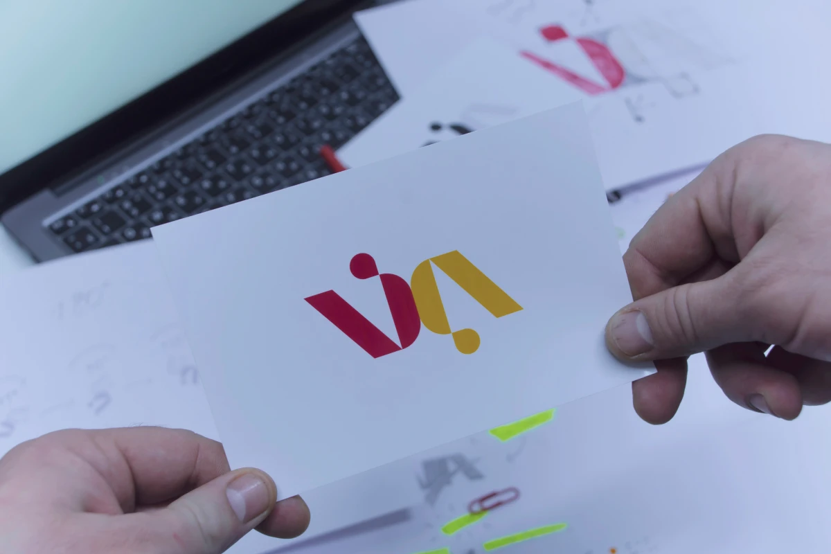
Logo Evolution
Modern logo refreshes simplify forms, improve digital scalability, and enhance versatility. Start by identifying your logo's recognition drivers—what shapes or symbols make it memorable. These elements stay. Next, pinpoint weaknesses: poor legibility at small sizes, dated illustration style, or colors that don't reproduce well digitally.
Evolution, not revolution. Mastercard removed their wordmark but kept the iconic interlocking circles. Companies that successfully redesigned their logos observed an average revenue growth of 11% in the year following the launch.
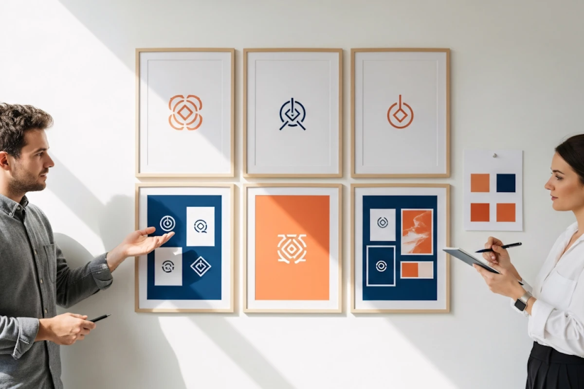
Color Palette Updates
Using a consistent color palette increases brand recognition by 80%. Update your palette to align with contemporary color psychology and digital display standards. Consider expanding your palette rather than replacing it. Keep your hero color but add complementary shades that provide flexibility.
Test colors across all mediums. What works on screen might fail in print. Ensure sufficient contrast for accessibility compliance.
Typography Choices
Typography communicates as much as words themselves. Select two typeface families maximum: one for headlines, one for body copy. Prioritize legibility over novelty. Variable fonts offer flexibility while maintaining consistency.
Photography and Imagery
Polished perfection gives way to authentic, inclusive visuals. Define your visual style through specific parameters: lighting approach (bright versus moody), composition rules (rule of thirds versus centered subjects), color treatment (vibrant versus muted), and subject matter (people-focused versus product-focused).
Consumers take about 10 seconds to form a first impression of a brand's logo, and that snap judgment extends to all visual elements.
The Counterargument: When Staying the Same Makes Sense
Refreshes cost money and demand organizational energy. Sometimes maintaining your current identity refresh timeline delivers better returns.
If your brand launched within the past three years, operates in a stable industry, and continues producing positive results, major changes might be premature. Consider brands like Coca-Cola that have maintained remarkably consistent identities for decades. Their restraint communicates stability and heritage.
The refresh-or-maintain decision depends on three factors. First, how quickly does your market evolve? Technology brands face faster obsolescence than industrial manufacturers. Second, how strong is your current recognition? Established brands with high awareness should move cautiously. Third, what's driving the impulse—legitimate market misalignment or internal boredom?
Calculate the expected return: will modernization genuinely increase conversions, or would those dollars perform better elsewhere? For brands serving niche markets with loyal customers, stability often outperforms change.
Step 4: Master the Brand Refresh Process Implementation
Design files sitting on a server accomplish nothing. The brand refresh process transforms strategy into customer experience through systematic rollout.
Prioritize your rollout by customer impact:
- Week 1: Update digital properties (website, social profiles, email signatures)
- Week 2: Revise digital marketing assets (ad templates, email campaigns, presentation decks)
- Week 3-4: Order and distribute physical materials (business cards, signage, packaging)
Nearly 90% of consumers expect the same experience whether they're visiting your website, app, or storefront. Each touchpoint needs specific adaptation. Your logo might work at website header size but fail as a social media profile icon.
The complete rollout spans 4-6 weeks. Rushing creates inconsistency. Dragging it out confuses customers who encounter mixed branding.
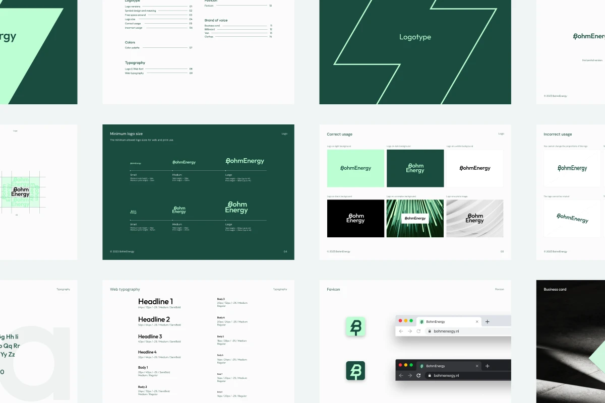
Step 5: Create Brand Guidelines People Actually Use
Brand guidelines prevent the slow degradation that makes your next refresh necessary. Consistent branding can improve consumer perception by nearly 70%, but only when teams actually follow the rules.
Your guideline document needs practical specificity. "Use blue" isn't helpful. "Primary blue: #0066CC (Hex) / RGB 0,102,204 / CMYK 100,50,0,0. Use for primary CTAs and headlines on white backgrounds. Never used as full backgrounds" gives designers actionable direction.
Cover these essential elements:
- Logo usage: minimum size requirements, clear space, approved variations, prohibited alterations
- Color system: primary colors with exact values, secondary colors, usage ratios
- Typography: approved typefaces for each use case, fallback fonts, size hierarchy
- Photography style: subject matter guidelines, lighting preferences, composition rules
- Voice and tone: word choices, sentence structure, how formality shifts by channel
Make guidelines accessible. A 60-page PDF gathering dust helps nobody. Create a simple one-page overview for quick reference, then provide detailed specifications in a searchable digital format.
{{mike-quote-2}}
Three Critical Mistakes That Kill Brand Refreshes
Mistake 1: Chasing Trends Instead of Serving Strategy
Every week brings new design trends. Adopting them because competitors do guarantees mediocrity. 74% of S&P 100 companies rebranded within their first seven years, but successful ones aligned changes with strategy, not aesthetics.
Decision makers see trendy designs winning awards. Designers want portfolio pieces showcasing contemporary skills. The path of least resistance leads toward whatever floods Behance.
Your brand becomes indistinguishable. When everyone adopts identical styles, differentiation vanishes. Worse, trends date quickly. That cutting-edge gradient you implement in March looks tired by September.
Evaluate every design decision against your strategic foundation. Does this color palette reinforce positioning? Will this style remain relevant in three years?
Mistake 2: Designing in Isolation Without Customer Input
You spend three months perfecting your refresh internally. The CEO loves it. You launch to complete customer indifference or confusion.
Internal teams see your brand constantly. They're bored with it before customers notice it exists. This over-familiarity breeds change for change's sake. Additionally, stakeholders fear criticism.
You solve problems customers don't have while ignoring problems they do have. Your new brand looks sophisticated but reduces conversion because it lacks contrast.
The testing requirement: Show refresh concepts to 20-30 customers before finalizing anything. Use A/B testing for digital elements. Ask specific questions: Which version communicates our values better? Which would you trust more?
Mistake 3: Forgetting That Implementation Matters More Than Design
Your refresh includes beautiful new guidelines. Implementation falters because nobody trained the team or enforced standards.
Organizations exhaust energy and budget on strategy and design phases. No single person owns the rollout. Different departments update materials on different timelines using different interpretations.
Six months after launch, your brand looks worse than before the refresh. Sales presentations use the old logo. Social media mixes old and new color palettes. This inconsistency communicates unprofessionalism.
The operational requirement: Assign a brand champion in each department who ensures compliance. Create pre-made templates for common use cases. Audit implementation monthly during the first six months.
Budget 40% of your refresh resources for implementation and enforcement. Great design implemented inconsistently loses to mediocre design implemented flawlessly.
{{vad-quote-1}}
What Most Brands Get Wrong About Color
Color isn't decoration. It's data that your brain processes before conscious thought arrives.
Using a consistent color palette increases brand recognition by 80%, but most brands squander this advantage through five technical mistakes:
- Ignoring device variance: Your carefully chosen navy (#1A365D) renders differently across screens. iPhones display warmer. Dell monitors skew cooler. Test your palette on at least five devices before finalizing.
- Forgetting print translation: RGB colors don't convert perfectly to CMYK. That vibrant teal you love becomes muddy in print. Always specify Pantone equivalents for physical materials.
- Violating accessibility standards: Nearly 90% of consumers expect the same experience whether they're visiting your website, app, or storefront. If 8% of males have color vision deficiency, inaccessible color combinations exclude potential customers. Your brand colors must meet WCAG AA contrast ratios (4.5:1 for body text).
- Overloading the palette: Brands add "accent colors" until they have 12 options. Cognitive load increases. Recognition drops. Limit yourself to three colors maximum: one primary, one secondary, one accent.
- Copying competitors: When five companies in your market use identical blue shades, you disappear. Map competitor colors on a wheel before selecting yours. Find the gaps.
The best approach: hire a color consultant for two hours. They'll save you months of expensive mistakes.
Measuring Success: What Actually Matters

You've launched your refresh. Now prove it worked. Consistent branding can improve consumer perception by nearly 70%, but you need metrics to demonstrate this improvement.
Start with baseline metrics captured before the transformation. Website conversion rates, social media engagement rates, email click-through rates, sales cycle length, and customer acquisition cost establish your starting point.
Track the same metrics for six months post-launch. Meaningful changes rarely appear immediately.
- Brand perception metrics reveal whether your refresh changed how customers see you. Survey the same customer group that participated in initial research. Ask: Has your perception of our brand changed? Does our visual identity better reflect our values?
- Business performance metrics matter most. Are more customers choosing you? Are deals closing faster? Nearly one-third of marketers say brand consistency led to a revenue increase of over 20%.
- Implementation compliance measures internal execution. Six months after launch, audit 20 random brand touchpoints across departments. What percentage comply with new guidelines? Anything below 90% suggests implementation problems.
Set realistic expectations. A refresh won't triple revenue overnight. If metrics move 10-25% positively within six months, your refresh succeeded.
Your Next Steps
You've read the guide. Now apply it.
Start with assessment: does your brand need updating? Gather customer perception data that answers this question objectively. If a refresh makes sense, commit proper resources. Plan for 2-3 months and $20,000-$50,000 depending on scope.
Assemble the right team. You need strategic thinking, design execution, and implementation project management. Consider whether internal resources suffice or external support makes sense.
Measure before and after. Establish baseline metrics now so you can prove results later.
Your brand represents hundreds of customer interactions annually. Making those interactions consistently communicate your value is worth the investment a refresh demands.