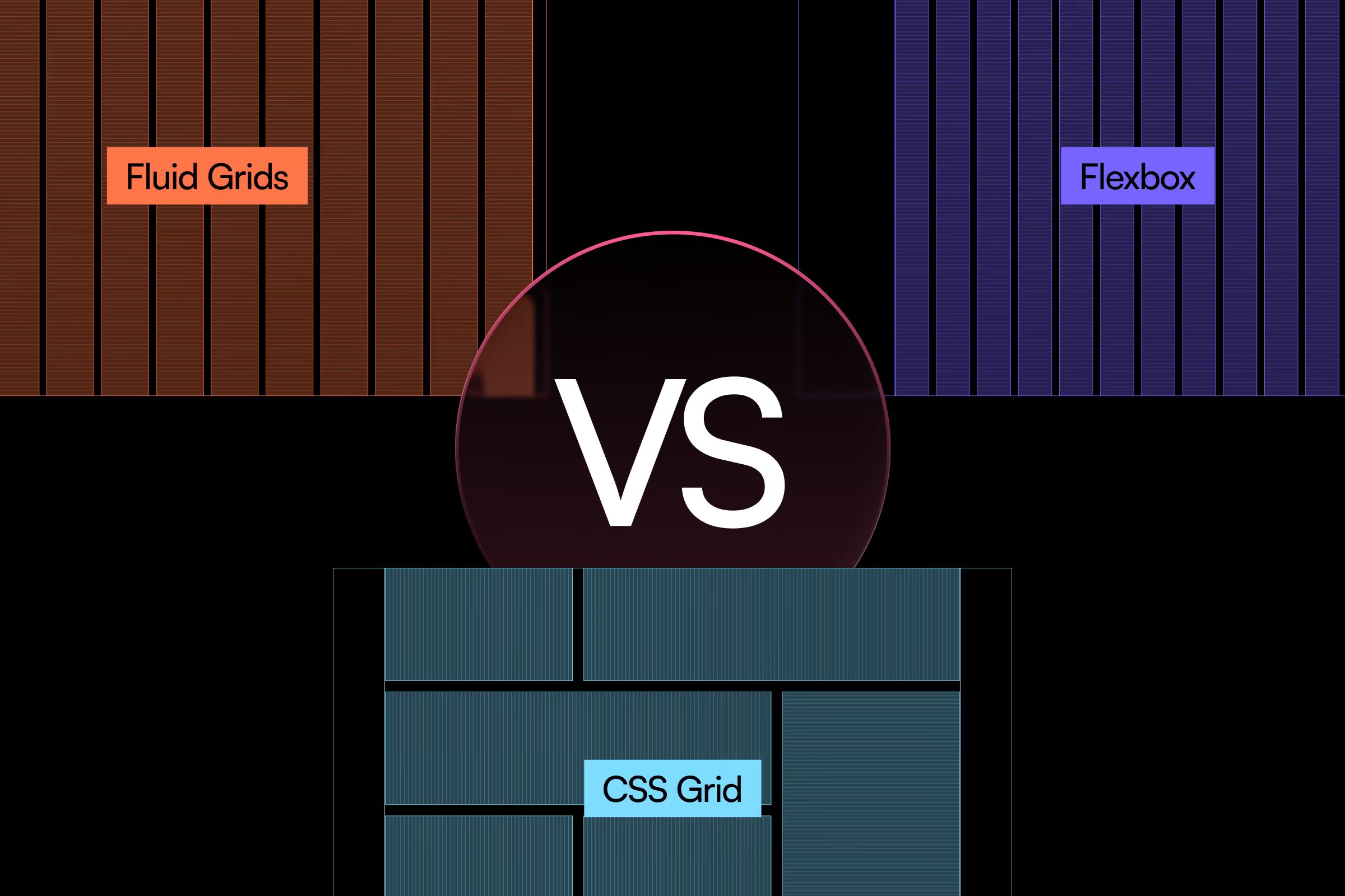
Modern responsive design lives or dies by how well your layout adapts. The three core technologies—Fluid Grids, Flexbox, and CSS Grid—each solve different problems. Understanding flex vs grid decisions (and when to deploy each) separates professional web architecture from guesswork.
How Did We Get Here?
Before 2010, web developers built layouts using <table> elements or absolute positioning hacks. Content broke across devices. Mobile screens rendered desktop layouts at microscopic scale.
Then came fluid grid layout systems—percentage-based widths that scaled proportionally. These worked for simple horizontal layouts but couldn't handle complex alignment or content reordering. Developers attempted frameworks like 960.gs and Bootstrap's float-based systems. These required clearfix hacks and excessive markup with floats.
The real shift arrived when browsers implemented Flexbox (2012) and CSS Grid (2017). These native CSS layout systems eliminated float workarounds and gave frontend developers control over both horizontal and vertical space simultaneously.
Fluid Grids: The Foundation Layer
Fluid grids use percentage-based widths to create proportional layouts. A three-column layout might use width: 33.33% for each column, scaling naturally as the viewport changes.
Best for simple horizontal scaling and legacy browser support. Limitations include no native gap control, poor vertical alignment, and manual breakpoint management.
{{vad-quote-1}}
Flexbox: The One-Dimensional Specialist
Flexbox excels at distributing items along a single axis—horizontal or vertical. It handles space distribution, alignment, and visual order automatically with wrapping capabilities.
Core capabilities:
- Dynamic spacing with justify-content and align-items
- Flexible sizing through flex-grow, flex-shrink, and flex-basis
- Visual reordering without touching HTML structure
- Ideal for navigation bars, card rows, button groups
A navigation bar with five links that expand to fill space requires three lines:
Add a sixth link tomorrow. No layout adjustments needed.
CSS Grid: The Two-Dimensional Powerhouse
Grid handles rows and columns simultaneously. This fundamental difference makes it ideal for page-level layouts and complex component arrangements.
When Grid wins:
- Magazine-style layouts with overlapping elements
- Dashboards with asymmetric panels
- Gallery systems where items span multiple rows/columns
- Any design requiring precise two-axis control
A dashboard with header, sidebar, main content, and footer becomes simple:
Each area positions itself automatically. Responsive redesign means changing the template at a breakpoint. The markup stays identical.
Grid vs Flexbox: How Do You Choose?
The difference between flexbox and grid is straightforward. Content flows in one direction (navigation, toolbars, card rows)—use Flexbox. You need precise two-axis control (page layouts, dashboards)—use CSS Grid. Simple proportional scaling—apply fluid principles within a grid or flexbox.
Professional implementations combine all three techniques. A grid layout contains Flexbox navigation and fluid-width images.
Choosing the right layout method is only half the battle. The bigger architectural question is whether your project needs a responsive or adaptive approach to handle multiple device contexts. Fluid grids, Flexbox, and CSS Grid are implementation tools, but the strategic decision about breakpoint philosophy and viewport optimization happens at a higher level. Understanding responsive vs adaptive architecture helps you determine not just which CSS technique to use, but how aggressively to embrace fluid scaling versus device-specific breakpoints. This architectural choice dictates how your Grid or Flexbox code will scale across the full device spectrum.
The Real-World Performance Impact
The layout method affects rendering speed. Grid and flexbox trigger fewer reflows than float-based systems because browsers optimize for modern layout algorithms.
Testing a product listing page with 120 items across layout methods showed measurable differences. Float-based fluid grid: 47ms layout time, 3 reflows on resize. Flexbox wrap: 31ms layout time, 1 reflow. CSS Grid: 28ms layout time, 1 reflow.
The milliseconds compound across thousands of users.
When Grid Creates Unnecessary Complexity
Grid's power comes with mental overhead. Defining explicit track sizes and template areas requires planning. For simple horizontal layouts like a row of buttons, Flexbox delivers identical results with less code.
The engineering tradeoff: Grid offers ultimate control at the cost of initial complexity. Flexbox sacrifices some precision for immediate simplicity. A button group needs display flex—display: flex; gap: 1rem;—while using display grid adds unnecessary markup when comparing display flex vs grid.
Pitfalls That Break Responsive Layouts
Fixed Widths Inside Flex Items
Developers write flex-basis: 300px for a sidebar, expecting it to shrink on mobile. It doesn't. The 300px becomes a minimum width, forcing horizontal scroll.
Desktop-first thinking causes this. The fixed width looks perfect at 1920px viewport.
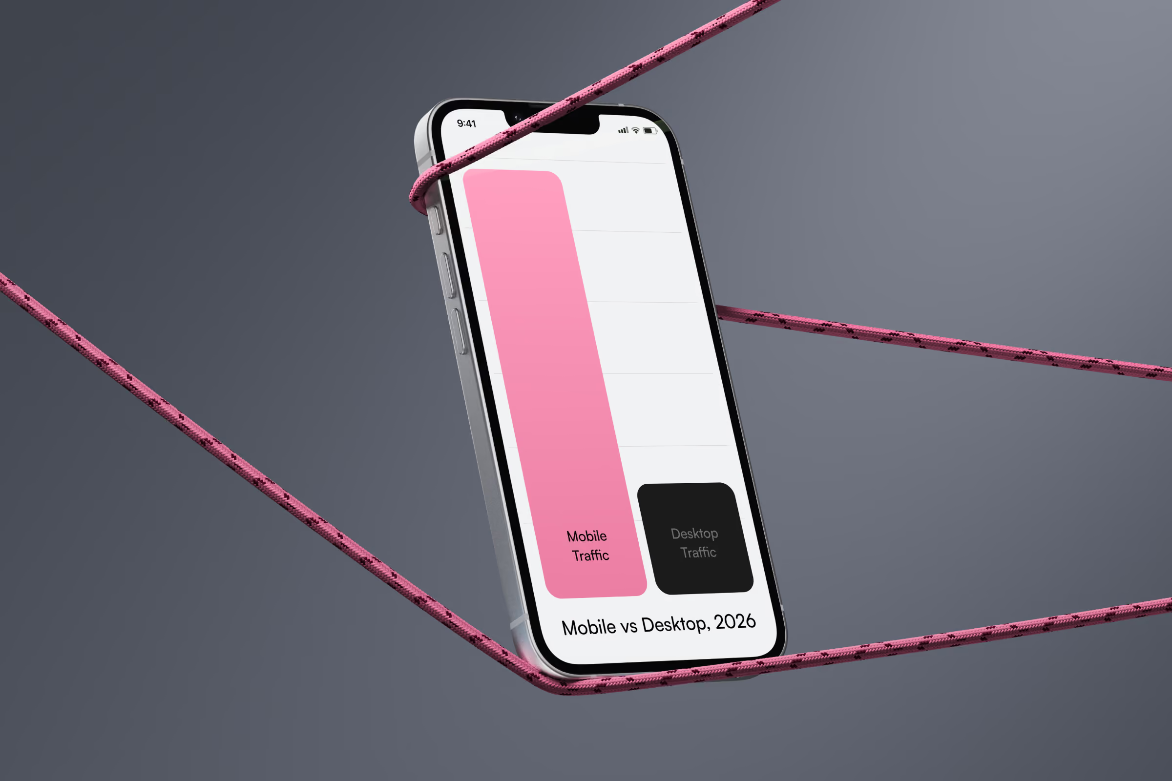
Mobile users scroll horizontally. The layout doesn't collapse at tablet breakpoints. Your responsive design breaks on 73% of traffic (mobile and tablet combined). Use flex-basis: 30% or combine with max-width: 300px to set upper bounds only.
Implicit Grid Rows With Auto Height
When Grid items exceed defined rows, browsers create implicit rows with auto height. Developers define a 3-row grid, add 10 items, and rows 4-10 have inconsistent heights.
This happens because developers assume grid templates define all possible rows.
Visual inconsistency appears across breakpoints. Items in auto-created rows ignore your grid-template-rows values. Card heights become unpredictable. Use grid-auto-rows: 1fr to control implicit row behavior.
Deep Flexbox Nesting
Four levels of nested Flexbox containers create debugging nightmares. Each layer adds complexity to space distribution. Alignment becomes impossible to predict.
This happens when incrementally solving layout problems without evaluating overall structure.
Browser layout engines recalculate flex distributions for each nesting level. A four-level nested flex layout takes 3x longer to render than a flat Grid structure achieving the same visual result. Replace nested Flexbox with single Grid containers when you exceed three levels.
Browser Support in 2026
Grid and flexbox work in 96%+ of global browsers. IE11 supported partial Flexbox and outdated Grid syntax, but its market share dropped below 0.5% in 2023.
Use Grid freely for main layouts. Flexbox works everywhere for component UI. Skip vendor prefixes unless supporting Safari 10 or earlier.
Bootstrap vs Flexbox: Combining Layout Methods
Production websites rarely use one technique. A typical page structure layers them strategically, combining grid with flexbox for optimal results.
Page shell uses CSS Grid for header, sidebar, content, and footer areas. The navigation bar uses Flexbox for horizontal distribution and vertical centering. Content images use fluid width with max-width: 100%. Product cards live in a grid container but use Flexbox internally for card content alignment.
Fluid-width images with max-width: 100% prevent overflow, but they don't solve the performance problem of serving 3000px images to 375px mobile screens. A perfectly responsive Grid layout still downloads oversized assets, wasting bandwidth and degrading load times.
Responsive images require the srcset attribute and sizes attribute to deliver resolution-appropriate files—a 1x image for standard displays, 2x for Retina, and next-gen image formats like WebP and AVIF for browsers that support them. Our responsive images guide with srcset and WebP/AVIF shows how to implement adaptive image delivery that matches your fluid layout's efficiency, ensuring the picture element serves optimized assets at every breakpoint Grid or Flexbox creates.
This approach deploys each technology where it excels. The header might be a Grid area containing a Flexbox navigation. Product cards use Grid for responsive columns with Flexbox for internal text and button alignment, demonstrating grid flexbox css integration.
Grid and Flexbox excel at controlling layout structure, but they hit a complexity wall with data-heavy content. Multi-column datasets with 8-12 fields present a different challenge—horizontal scrolling breaks mobile table UX, while vertical stacking destroys scannability.
Responsive data tables require specialized patterns beyond standard Grid containers: collapsible table rows, adaptive table layouts that prioritize key columns, and touch-friendly interfaces for filtering. Our guide on handling complex data tables on mobile screens details the hybrid approaches that combine CSS Grid's structural control with JavaScript-driven progressive disclosure techniques specifically for tabular data visualization on mobile.
What This Means for Your Next Project
Choosing layout methods early prevents expensive refactoring. Start with Grid for page structure. Add Flexbox for component layouts. Use fluid principles (percentages, fr units) within both.
Multi-column content with varying heights needs Grid. Single-row navigation or button groups need Flexbox. Pixel-perfect alignment in two dimensions requires Grid. Content order changes at breakpoints can use Flexbox order or Grid grid-area repositioning.
The layout foundation determines how well your interface scales. Understanding what is the difference between css grid and flexbox provides architectural tools that fluid grids alone couldn't deliver. Whether you choose flex vs grid in css for your next project, combine them strategically for optimal results. The flexbox and grid difference lies in dimensional control—Flexbox handles single-axis layouts while CSS Grid manages two-dimensional structures simultaneously.

.avif)