

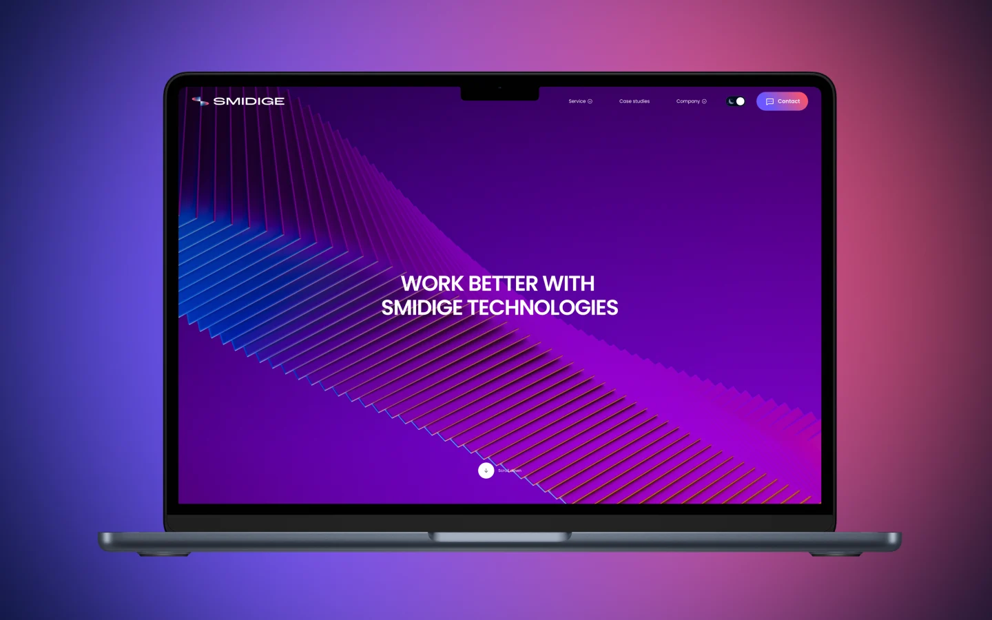
Responsive web design
When B2B startups look for a responsive web design company, they usually get generic mobile adaptations. At Celerart, we take an engineering approach. We build scalable digital experiences exclusively on Webflow, optimizing Core Web Vitals across all viewports to drive conversions without developer dependency.
Our Adaptive Webflow Methodology
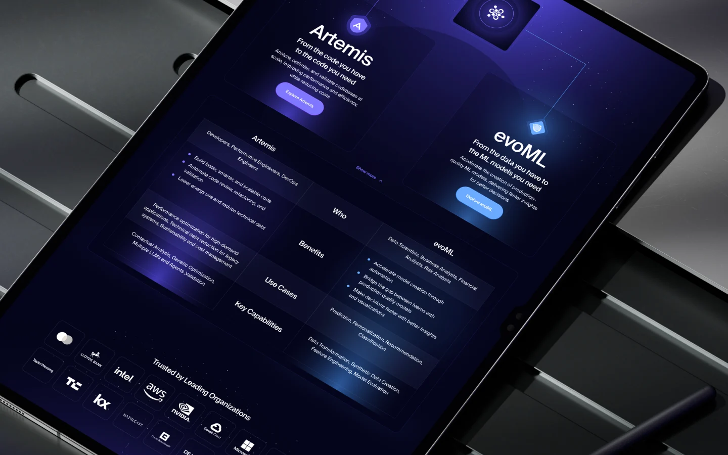
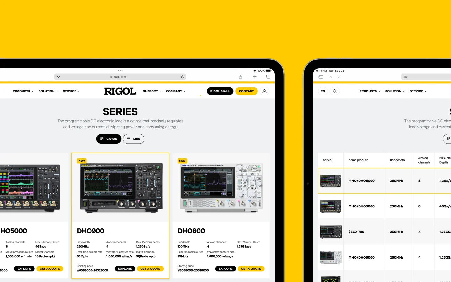
We don't just resize layouts. We engineer specific experiences for 5 distinct Webflow breakpoints (Desktop, Tablet, Mobile Landscape, Mobile Portrait, and Ultra-Wide).
Increased Mobile Traffic
Improved Conversion Rates
Higher SEO Rankings
Faster Load Times
Cost-Effective Design
Better User Retention
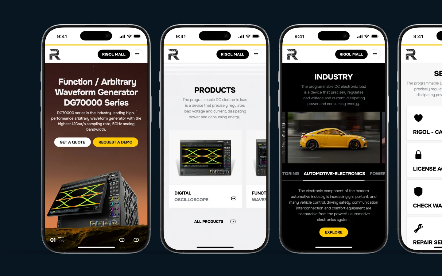
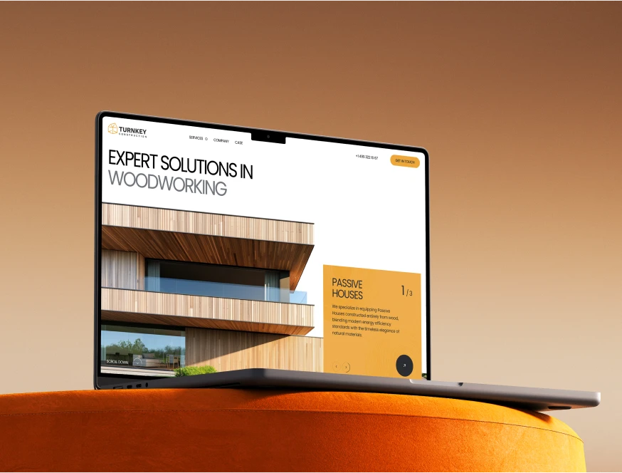
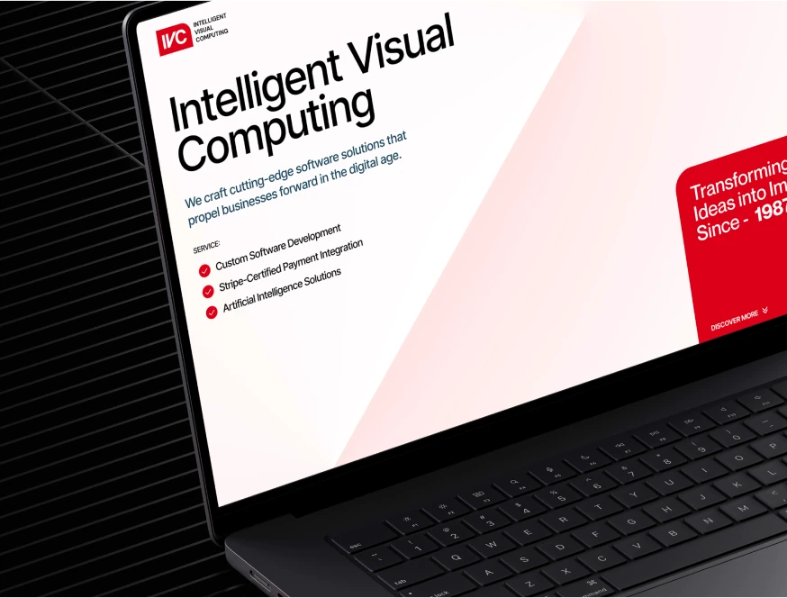
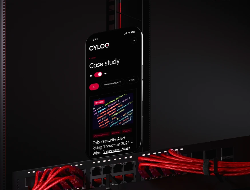
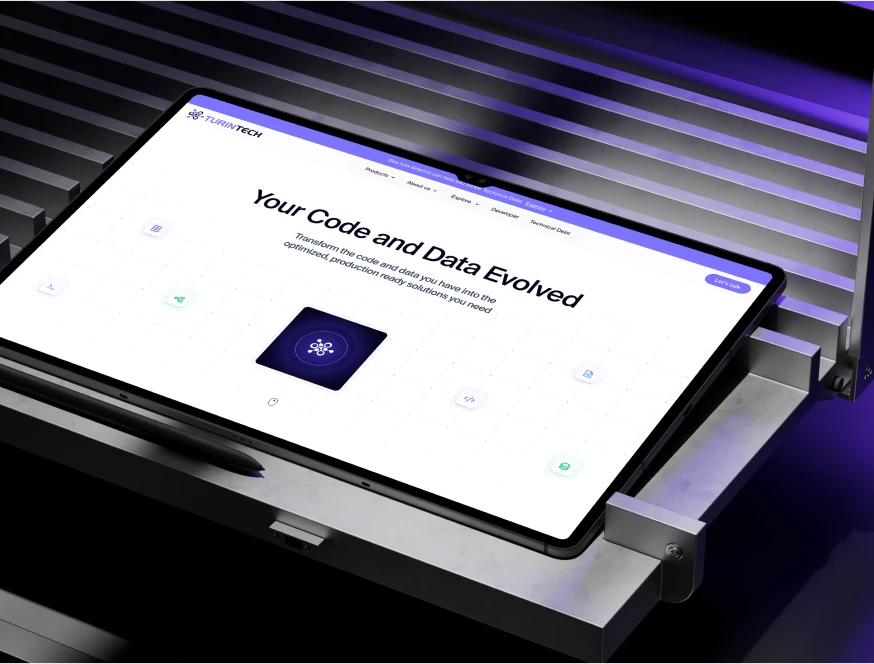
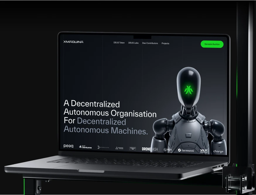
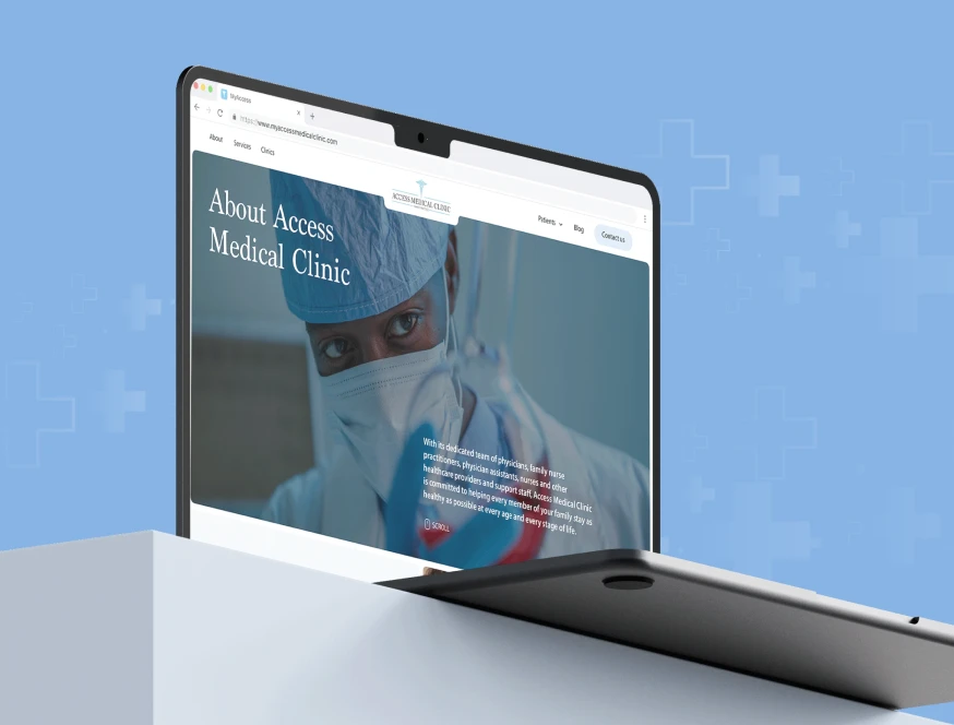
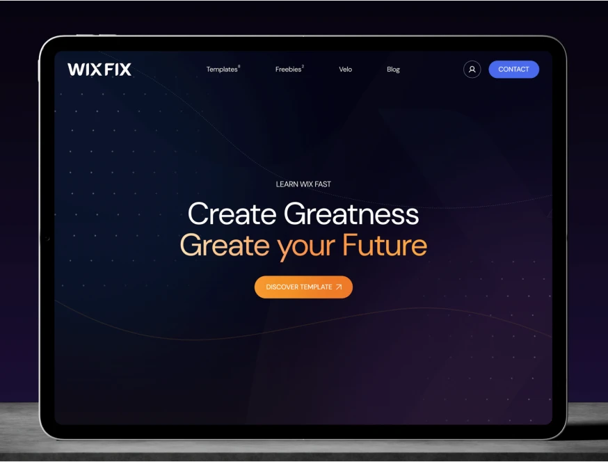
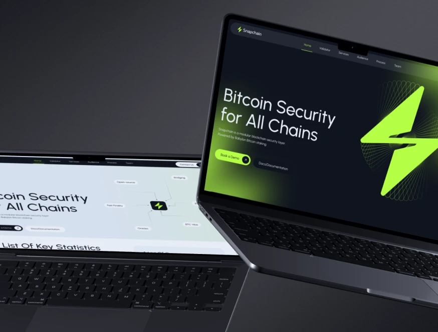
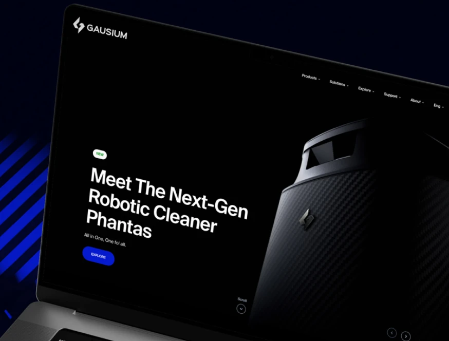
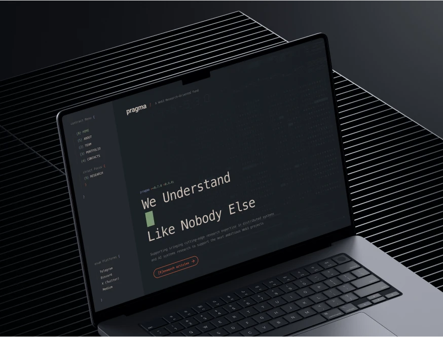
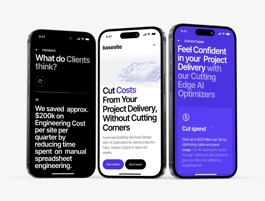
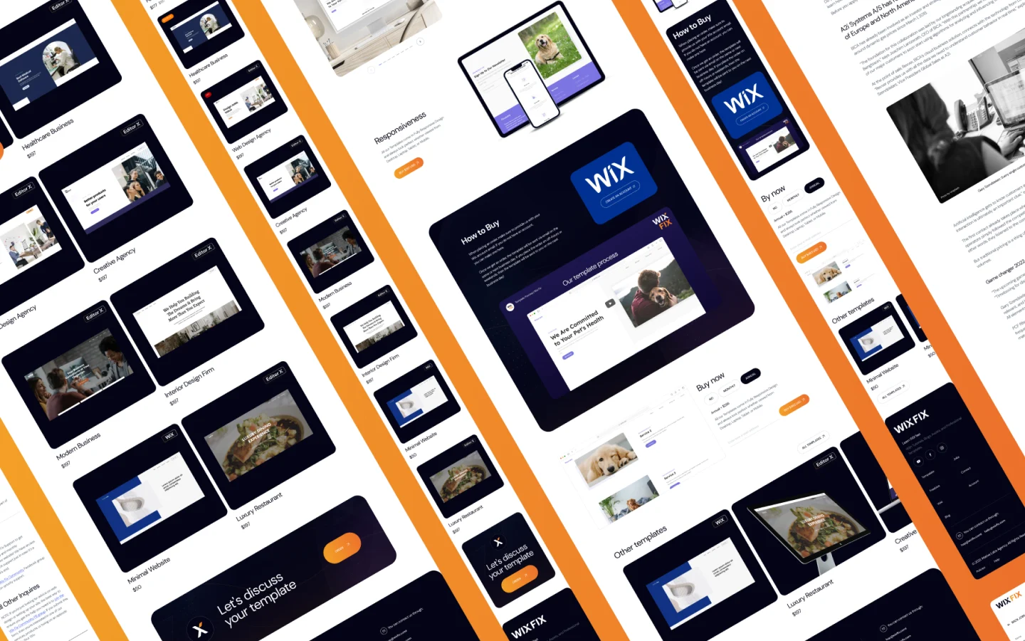
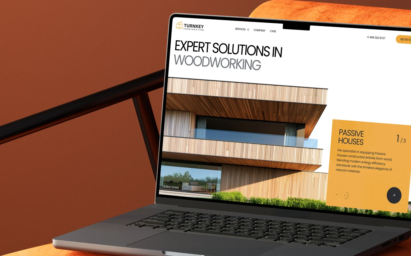
Designs Worth Remembering
A curated mix of visuals that speak louder than words — bold, refined, and uniquely crafted.


Our Adaptive Webflow Methodology
A responsive site is useless if it's slow. Our engineering process directly targets Google's Core Web Vitals to protect your SEO visibility:
01
UX/UI Contextual Design
We design custom navigation patterns and touch-targets specifically for mobile users, avoiding generic template constraints.
02
Semantic HTML5 & CSS Grid
Our developers use clean CSS Grid and Flexbox within Webflow to ensure elements reflow logically without code bloat.
03
Responsive Asset Optimization
We configure Webflow to automatically serve WebP and AVIF formats based on the user's screen size, directly reducing Largest Contentful Paint (LCP).
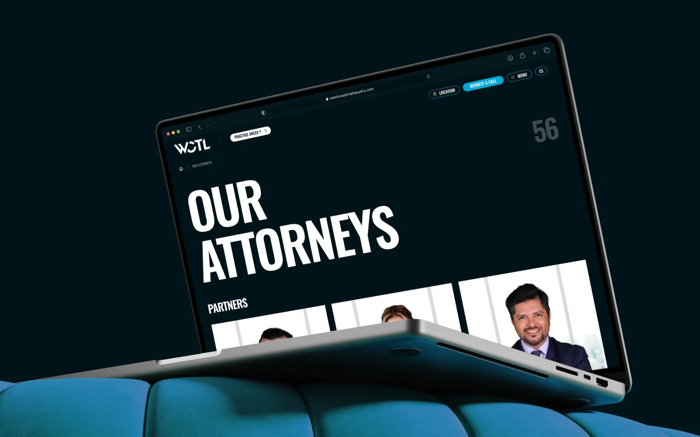
Meet the Team Behind the Work
Each of us contributes our own perspective, skills, and dedication to deliver thoughtful, high-quality digital solutions for our clients around the world.
Pavel S

Vad S.

Mike V.

Dmitry M.

Maxim N.

Vladimir M.

Vlad B.

Ivan P.

David Z.

Danil K.

Eugene V.

Roman V.

Vlad H.

Pavel S.
Performance Metrics We Optimize For
01
INP (Interaction to Next Paint)
We keep mobile interactions under 200ms by minimizing third-party script blocking.
02
CLS (Cumulative Layout Shift)
We reserve space for dynamic elements and images so your layout never jumps on mobile devices.
03
Conversion Parity
Our goal is to bring your mobile conversion rates as close to your desktop rates as possible by removing mobile-specific friction points (e.g., complex forms, unreadable typography).
Get Started
Let’s Build the Perfect Solution for Your Business

Other Services
We Offer
Project Scope and Timelines
We work with a maximum of 3-4 clients simultaneously. Deep strategic immersion requires focus, not assembly-line production.
- Typical Timeline: 8 to 12 weeks from kickoff to deployment.
- Who We Help: B2B SaaS, tech startups, and professional services firms needing high-authority digital presence.
- When We Decline: We do not take projects requiring native mobile app functionality (offline mode, native push notifications). In those cases, responsive web design is the wrong technical solution.
Do you use Webflow templates?
No. We build custom responsive architectures from scratch using "Client-First" or "Relume" class naming conventions for maximum scalability.
How do you handle mobile SEO?
We ensure 100% parity between mobile and desktop content, use semantic tags, and optimize loading scripts to meet Google's Mobile-First Indexing requirements.