

App Design Agency
We design mobile applications for businesses that need more than templates — companies where the app directly impacts revenue, retention, or operations. As a mobile app design agency, we understand that modern interface work is infrastructure, not decoration. Every screen, interaction, and flow serves a measurable business goal. We work with three to four projects simultaneously because each requires deep immersion into your market, audience, and objectives.
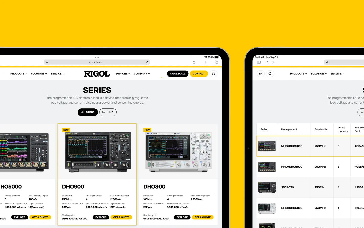
Planning Projects at Our Design Agency for Mobile Apps
We're selective about the work we take on. Not every app idea needs our level of involvement, and we're honest when a simpler approach would serve you better. As a consultancy, we evaluate each project's fit with our capabilities and provide transparent guidance on price expectations. Our clients typically fall into four categories, each with specific design requirements that generic solutions don't address.
Intuitive Navigation
Behavioral research with your actual target audience
Task flow planning and information architecture
Wireframe testing and sketching to catch usability problems early
Interface design optimized for one-handed use
Deliverables and design systems developers can actually implement
Designs Worth Remembering
A curated mix of visuals that speak louder than words — bold, refined, and uniquely crafted.


Planning Projects at Our Design Agency for Mobile Apps
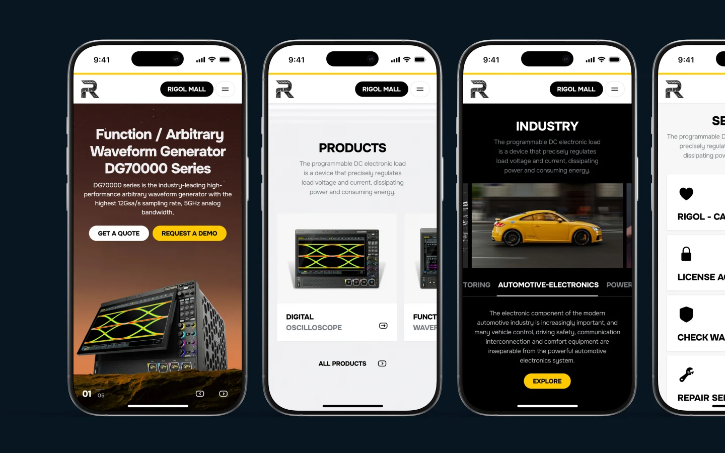
Platform conventions exist for reasons that took Apple and Google years of research to discover. iOS expects certain navigation patterns. Android expects different ones. We design within these guidelines while maintaining your brand identity. That balance is harder than it sounds. Your brand color might not meet accessibility contrast ratios. Your desktop navigation might not work on 375px screens. We solve these through systematic decisions, not compromises that weaken both design and usability. Typography matters more on mobile than anywhere else because people scan apps in bright sunlight, on moving trains, while walking.
01
Consumer apps where UX determines survival
People decide whether to keep your app within 30 seconds. We design onboarding that demonstrates visual value immediately, not through tutorial screens. One fitness app client had 68% Day 1 retention before redesign. After we rebuilt the first experience to show personalized recommendations within 15 seconds, retention jumped to 81%. The interface teaches through use, not instructions.
02
Business tools replacing manual processes
Your team uses spreadsheets, paper checklists, or desktop software that doesn't work in the field. The app needs to match actual workflows, which means we observe your operations before designing anything. We built a logistics app for drivers working offline for six-hour stretches. The cross platform solution syncs when connectivity returns, with clear indicators showing what's cached versus uploaded.
03
Validated products needing professional execution
You've proven demand through landing pages, MVPs, or beta testing. Now you need an app that scales without breaking. Our studio designs flexible component systems where new features don't require interface rebuilds. The architecture accommodates growth you can't predict yet.
04
Internal platforms where efficiency impacts revenue
Restaurant staff taking orders during dinner rush. Warehouse workers scanning inventory under time pressure. Medical personnel accessing patient data between appointments. These apps can't afford confusion or extra taps. We optimize for speed and design for real conditions — poor lighting, gloves, one-handed use, cognitive load.
Meet the Team Behind the Work
Each of us contributes our own perspective, skills, and dedication to deliver thoughtful, high-quality digital solutions for our clients around the world.
Pavel S

Vad S.

Mike V.

Dmitry M.

Maxim N.

Vladimir M.

Vlad B.

Ivan P.

David Z.

Danil K.

Eugene V.

Roman V.

Vlad H.

Pavel S.
Mobile App Design Services: Interface Structure
01
Navigation systems that match platform expectations
iOS expects bottom tab bars for primary navigation. Android expects navigation drawers or top tabs. Fighting these patterns makes apps feel foreign. We've seen apps lose 40% of the audience in the first week simply because navigation didn't behave like other apps on their device. Whether native or hybrid, platform compliance isn't limiting — it's respecting learned behavior.
02
Typography scaled for difficult reading conditions
People read apps while walking, in sunlight, with declining vision. We choose type scales that remain legible across these scenarios and test readability on actual devices. Body text below 16px fails for 30% of people over 40. Contrast ratios matter more than aesthetic preference. We optimize for reality, not design tool artboards.
03
Touch targets sized for thumbs, not cursors
Designers often forget that fingers are less precise than mouse pointers. Apple's Human Interface Guidelines recommend 44x44pt minimum touch targets. Android recommends 48x48dp. We go larger for critical actions because the cost of a missed tap is frustration. One checkout flow we redesigned lost 34% of conversions because the "Complete Purchase" button sat in an awkward top corner. Moving it to thumb-reachable space recovered most of that loss.
Get Started
Let’s Build the Perfect Solution for Your Business

Other Services
We Offer
What usually derails mobile app projects — and what the mistakes actually cost your business
- Teams design for ideal conditions because that's how they test. You're on office WiFi with a new device. Your customers have three-year-old phones on spotty connections. Apps that don't handle slow loading or offline states lose 53% of people within three seconds of a bad experience. Every second past two seconds of load time drops conversion by 12%. Design skeleton screens, cache critical content, show progress indicators. The alternative: watching half your potential customers churn before seeing your value proposition.
- Stakeholders push for feature parity with competitors because it feels safer than focus. You end up with 30 features people must learn instead of three that solve real problems exceptionally well. Overloaded apps average 2.5-star ratings. Focused apps doing one thing brilliantly average 4.2+ stars. The cost: eight months building complexity that drives people toward simpler alternatives. As a mobile application design company, we've turned down projects where clients wanted every competitor feature replicated. That's not design — it's checkbox thinking that guarantees mediocrity.
- Ignoring platform conventions to maintain brand consistency creates interfaces that feel wrong. Your website's navigation might be brilliant, but iOS expects bottom tabs and Android expects drawers. Fighting learned behavior makes your app exhausting to use. People abandon apps that don't behave like other apps on their device within the first week at rates 40% higher than platform-compliant designs. Brand consistency matters, but not at the expense of usability patterns millions have internalized.
When an App Redesign Agency Isn't What You Need
We don't take every project that contacts us. Apps aren't always the right solution, and we're honest when alternatives serve you better. Before engaging any design agency for mobile apps, run an audit of whether mobile truly fits your use case.
Complex data entry works poorly on phones. If your primary use case requires typing paragraphs or multi-step forms, desktop interfaces serve better. Apps that people need once or twice yearly don't stay installed — they get deleted when they don't provide regular value. If your use case doesn't create habit formation, progressive web apps give mobile functionality without App Store friction.
We work with clients who understand quality requires time and proper execution requires appropriate budget. If your project aligns with what we do well as a mobile app design agency — and you're ready to start in the next few months — let's discuss it.