Renewable Energy Web Design & Brand For Solar Tech Company Bohm Energy

Date
2024
Industry
Tech Startups
Renewable Energy
Home Automation
Client
BohmEnergy
Services
Branding
UI / UX
Webflow Development
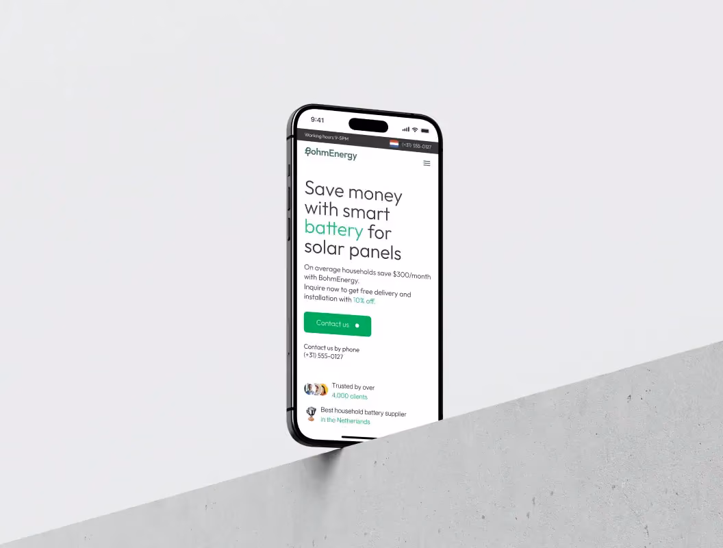
BohmEnergy is a startup from the Netherlands that installs smart batteries for homes with solar panels to store the energy produced during the day, as well as sell it back to the grid, enabling the owner to save a lot on the bills!
It's all about clean, renewable energy, so we created an appropriately clean brand identity, design a nice simple website, and built it with Webflow, like we usually do. A bit of graphics here and there, minor interactivity, some generated and photoshopped product shots, and here it is. On the homepage, an isometric house animation that we made, shows exactly how it all works.


BohmEnergy is a Netherlands startup that helps homeowners with solar panels do something smart with the energy they generate during the day. Their product—smart batteries—stores that excess energy and even sells it back to the grid when prices are high. The result for homeowners: significantly lower electricity bills.
The company approached us needing a complete digital presence. They had the technology but no brand identity and no website. As a renewable energy web design agency, we centered the project on one core idea: clean energy deserves a clean visual approach. We created brand identity, designed a simple website, and built it on Webflow. The homepage features an isometric house animation showing exactly how the system works.
Why Did BohmEnergy Need This?
Most startups in renewable energy face the same problem. The technology works, but explaining it to regular homeowners gets complicated fast. Solar panels people understand. Batteries that talk to the electrical grid and sell energy back during peak hours? That requires explanation.
Effective renewable energy web design solves this communication gap. Without clear visual explanation, even the best technology struggles to find customers.
BohmEnergy needed to establish credibility quickly. When you're asking homeowners to make a significant investment in equipment they'll mount in their garage, trust matters. Without an existing brand or visual identity, everything rested on first impressions.
The website had to do heavy lifting. It needed to answer the fundamental question every potential customer has: "How does this actually work?" Text explanations don't cut it for energy flow and storage. People need to see it.
Budget and timeline favored a focused approach. This wasn't a six-month branding exercise with extensive research phases. The company needed to launch and start generating leads.
What Does Clean Energy Look Like?
Renewable energy companies often fall into predictable visual territory. Lots of green. Leaf motifs. Photos of wind power installations. Earnest statements about saving the planet. While authentic, this creates sameness across the entire sector.
Successful green web design requires differentiation, not following the same tired patterns every competitor uses.
We took a different path for BohmEnergy. If the core message is "clean energy," then the brand identity itself should feel clean. Uncluttered. Modern. Straightforward.
The identity system included standard brand elements—logo, color palette, typography—but the real work was establishing visual principles that could scale. Since we knew Webflow would host the website, every design decision considered how it would translate to digital implementation.
The color choices avoided the obvious green-heavy palette. The typography leaned toward clarity over decoration. The overall aesthetic communicated "smart technology" as much as "sustainable power." Homeowners shopping for battery systems care about reliability and savings first, environmental impact second. The brand needed to speak to that priority.
Building on Webflow Made Sense
Platform choice matters more than people realize. Webflow offered the right combination of custom design flexibility and client independence. The company could update content, adjust pricing, or add new information without needing a developer for every small change.
For a startup, that independence is valuable. Marketing priorities shift quickly. Product specs evolve. The ability to make changes internally keeps the website current without accumulating technical debt or change request backlogs.
Webflow also handles hosting reliably and scales easily. One less infrastructure concern for a young company with limited technical resources.
The Isometric Animation Changed Everything
The homepage centerpiece solved the core communication challenge. An isometric house animation walks visitors through the entire system:
- Solar panels generating energy during the day
- Excess energy flowing into the battery storage
- Stored energy powering the home at night
- Surplus energy selling back to the grid during peak hours
This visualization does what paragraphs of text cannot. People see the energy flow. They understand the complete cycle in seconds rather than struggling through written explanations of kilowatt-hours and grid connectivity.
Isometric perspective offered the right balance. Detailed enough to show how components connect, simple enough to grasp immediately. Not childish cartoons, not overly technical diagrams. Just clear visual storytelling.
Creating this animation required careful calibration. Too much technical detail overwhelms. Too much simplification feels condescending. The final version respects viewer intelligence while making complex concepts accessible.
Graphics and Product Imagery
We kept graphics minimal throughout the site. A few custom illustrations reinforced key benefits, but decoration stayed sparse. Every visual element had a job—clarify a concept, emphasize an advantage, break up text blocks.
Product photography presented a practical challenge. The physical batteries weren't available for traditional photoshoots. We generated imagery and used Photoshop to create realistic product representations in home settings. These showed the batteries mounted in garages and utility spaces, helping potential customers visualize the actual installation.
The site included minor interactive elements—hover states on buttons, smooth scrolling between sections, subtle animation triggers. Nothing flashy. The interactivity enhanced the experience without dominating it or distracting from information.
Modern renewable energy web design balances aesthetics with functionality, ensuring every element serves the user's understanding.
Why This Renewable Energy Web Design Approach Works
Several factors made the strategy effective. Visual alignment with product positioning creates consistency. When your product is about eco-friendly energy storage, visual clutter undermines that message. The minimal aesthetic reinforced the core concept.
The educational focus addressed buyer psychology. People don't impulse-buy battery systems. They research, compare options, and calculate return on investment. By frontloading clear information, the website qualifies leads effectively. Visitors who reached out already understood the basics.
Webflow's capabilities matched project needs precisely. Custom design without ongoing developer dependency. Content update flexibility for the client. Reliable hosting without infrastructure headaches.
The isometric animation proved especially valuable. Complex technical concepts compress into visual storytelling. Instead of reading multiple paragraphs about daytime generation and nighttime usage, visitors watch it happen. This removes friction from understanding.
"In cleantech projects, the biggest mistake is assuming environmental motivation drives purchasing decisions. Most homeowners care about costs first. The brand and website need to lead with financial benefits, then support with environmental impact. Reversing that order loses the practical buyers."

Creative Director at Celerart
How Green Web Design Has Changed
Fifteen years ago, renewable energy websites followed predictable patterns. Heavy imagery of solar farms and wind turbines. Long paragraphs about environmental responsibility. Minimal explanation of how products actually worked or what they cost.
That approach had problems. It failed to address practical buyer concerns about installation, costs, and actual savings. It also created visual sameness—every cleantech company looked identical.
Several shifts pushed the industry toward clearer communication:
- Solar and battery systems moved from early adopters to mainstream homeowners who needed practical information
- Increased competition made differentiation critical
- Better web technology enabled sophisticated visual explanations without complex custom development
Old cleantech design treated environmental consciousness as sufficient motivation. Modern approaches recognize that buyers have multiple priorities. Yes, they care about sustainability. They also care about return on investment, reliability, and whether installation will be complicated.
Some companies overcorrected into overly technical territory. Websites drowning visitors in kilowatt-hour calculations and electrical specifications. Others went too simple, creating messaging that felt condescending. The effective middle ground respects complexity while making it accessible.
The BohmEnergy approach benefits from this industry evolution. Clean design without preaching. Technical accuracy presented clearly. Financial benefits stated directly. Environmental impact as supporting benefit, not sole pitch.
Common Traps We Avoided
Three mistakes catch many cleantech website projects:
1. Overcomplicating the technical explanation
Energy companies often assume visitors need comprehensive technical education. They pack homepages with specifications, efficiency percentages, and electrical diagrams.
Why this happens: Engineering teams drive content decisions. Engineers love specifications and want to prove technical credibility.
Confused visitors leave. Someone researching green energy solutions wants to know "will this work for my house?" before caring about exact discharge curves.
We kept the BohmEnergy homepage focused on user benefits. Technical specifications exist on a dedicated product page for people who want that depth. Most visitors never need it—they want to understand the concept and see if it fits their situation.
2. Generic environmental messaging
"Save the planet" statements saturate cleantech marketing. While authentic, they don't differentiate or address practical concerns. When every competitor says virtually the same thing about sustainability, the message loses impact.
Why this happens: Environmental mission drove the company's founding. It feels important to emphasize. Marketing teams worry that focusing on financial benefits seems mercenary.
You sound like everyone else. Homeowners see identical "good for the planet" messaging on five websites and have no basis for choosing.
For BohmEnergy, environmental benefits appeared as supporting points, not the lead message. The primary pitch focused on energy optimization and bill reduction.
3. Neglecting visual explanation
Text-heavy explanations of how systems work fail frequently. Reading about energy flow between components requires mental modeling most people won't do.
Why this happens: Written explanations feel thorough. Creating custom animations requires extra budget and time. Stock imagery seems like an adequate shortcut.
Visitors leave without understanding the product. Even interested prospects struggle to explain the concept to spouses or family members, reducing conversion.
The isometric animation eliminated this barrier entirely. Watching energy move through the system builds understanding instantly.
Key Takeaways for Similar Projects
Five lessons from this project apply broadly:
- Match visual identity to product positioning, not industry conventions. BohmEnergy's clean aesthetic worked because it directly reflected clean energy principles. Industry visual tropes make you blend in, not stand out.
- Solve the primary user question first. For BohmEnergy, that question was "how does this work?" The isometric animation answered immediately. Identify what visitors need to understand before they can move forward, then design around that question.
- Choose platforms for long-term needs. Webflow provided design flexibility and client independence. Consider who maintains the site after launch and what changes they'll need to make.
- Make interactivity purposeful. Minor interactive elements throughout the site felt modern without distracting. Each interaction had a purpose—revealing information, confirming actions, guiding attention.
- Lead with practical benefits. Environmental benefits resonate as secondary reinforcement after financial benefits are clear. This might feel counterintuitive for mission-driven companies, but it matches how most buyers make decisions.
Alternative Paths We Could Have Taken
A different strategy could have worked. A template-based WordPress approach using a premium theme would have launched faster and cheaper.
This would have meant selecting a quality theme designed for tech products, customizing it with BohmEnergy branding, and using existing plugins for interactions.
The trade-offs matter. Templates launch faster and cost less upfront. For a brand-new startup conserving capital, this makes sense. The site gets online quickly and supports initial customer acquisition.
However, templates limit differentiation. BohmEnergy would have looked similar to other sites using the same theme. The custom isometric animation—the most effective explanatory tool—would have required expensive custom development anyway.
We chose Webflow because BohmEnergy needed unique positioning quickly. The battery storage market already had established competitors with name recognition. Standing out visually gave them a chance at capturing attention despite being new.
Template approaches work better when brand building isn't the immediate priority. If you're selling through partnerships rather than direct marketing, or if differentiation comes from price or service rather than brand, templates make sense.
What a Renewables Brand Agency Learns from Projects Like This
The BohmEnergy project shows a broader shift in energy technology marketing. Selling sustainability purely on environmental merit doesn't work anymore. Modern buyers want environmental responsibility and financial sense and convenience and reliability.
Environmental benefits still matter. They just can't carry the entire marketing burden. The successful approach combines practical benefits upfront with environmental impact as validation.
Visual communication grows increasingly important as products become more technical. Battery systems require explanation before purchasing. Companies that invest in clear visual education gain advantages over competitors relying on text descriptions.
Platform choices matter more than startups initially realize. Launching quickly feels urgent, but switching platforms later costs more than doing it right initially. Consider the three-year roadmap: What content changes will you need? Who makes updates? What integrations might you add?
Clean, modern design isn't just aesthetic preference—it's strategic alignment. When your product promise involves sustainable energy, your visual presence needs to embody that cleanliness and simplicity.
Solar Energy Web Design: Essential Elements
Working with solar energy web design projects reveals consistent patterns. Homeowners shopping for solar solutions need specific information presented in specific ways.
First, they need to understand the technology without getting overwhelmed. The isometric animation approach we used for BohmEnergy applies equally well to solar panel installations, inverter systems, and grid-tied configurations.
Second, they need financial clarity. Solar investments involve upfront costs, long-term savings, tax incentives, and financing options. The website should present this information clearly without requiring visitors to hunt through multiple pages.
Third, they need social proof. Customer testimonials, installation photos, and performance data build trust. New companies benefit from showcasing completed projects, even if the portfolio is small initially.
The BohmEnergy approach demonstrates these principles effectively. Clear technical explanation through animation. Financial benefits stated upfront. Simple, uncluttered design that builds credibility.
Lessons from Renewables Creative Agency Work
Working as a renewables creative agency means understanding both design principles and energy sector specifics. Generic design approaches don't work because the audience has unique concerns and decision-making processes.
The organic growth of the renewable energy sector creates opportunities and challenges. New companies enter the market constantly, each needing differentiation despite offering similar products. Battery storage, solar panels, inverters—these products all solve related problems but require distinct positioning.
Brand identity in this space must balance technical credibility with accessibility. Too corporate and you alienate environmentally-conscious buyers. Too hippie and you lose the practical, ROI-focused crowd. Finding the middle ground requires understanding audience psychology deeply.
The BohmEnergy project succeeded because we focused on clarity and education rather than decoration and hype. The brand feels modern and trustworthy without being generic. The website explains effectively without overwhelming.
Final Thoughts on Renewable Energy Web Design
This project succeeded by staying focused on the core challenge: making a technical product understandable and a new brand trustworthy. The clean identity reinforced clean energy positioning. Webflow provided flexibility for growth. The isometric animation solved the primary comprehension barrier.
Not every project needs custom animation or extensive brand development. But when entering a competitive market with a complex product, investing in clear communication and distinctive design provides real competitive advantage.
The patterns that worked for BohmEnergy—clarity over complexity, practical benefits over idealism, visual explanation over text—apply across the cleantech sector and beyond. Any company selling technical products to regular consumers faces similar communication challenges.
The website launched with a complete brand identity system. BohmEnergy now had the visual foundation to support marketing, sales conversations, and customer education. More importantly, the brand system scales. As the company grows, adds products, or expands to new markets, the visual identity and design principles provide a consistent foundation.


